Graphic Artist Wanted
-
I came up with these, tried to go for a UEF commander look. I had a lot of fun making them!
EDIT: Slightly improved(?) version!
-
@GGhost272 Like a sequentially upgrading mask, very cool!
-
I'd like to make a new second entry for a second style :
T1 :


T2 :


T3 :


T4 :


T5 :


-
@tatsu Looks cool but I think just changing the size makes it pretty hard to tell between the sub tiers. Like if you just see one of them you won't be sure if it's tier 2 or 3 because they both look too similar.
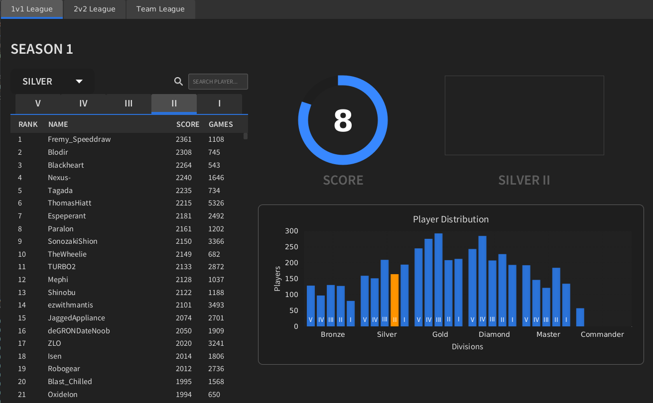
Here's my idea, although I'm not particularly good at the graphics so maybe someone wants to take inspiration from it and come up with their own version, or just use this as a base and make it better. Go for it, you have full permission!
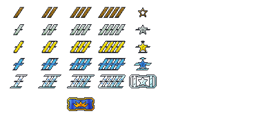
Divisions are differentiated by color, sub-divisions are differentiated by the number of stripes or stars and the final tier gets its own special icon. I tried to go for the commander mask, but it could be anything so long as it strikes fear into the hearts of your enemies.
I guess you need to be careful with colors because of colorblindness, so maybe the border should get progressively more fancy as you go up divisions. Something like
Bronze -> no border
Silver -> Top and bottom
Gold -> Full border plain
Diamond -> Full border embellished
Master -> Even more embellishedAnyway, I've spent too much time making this already

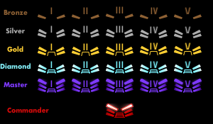
Edit: I worked on polishing it up and heres what I came up with. I kindof made the mistake of assuming the rank numbers increase as you gain rank, but it's supposed to be the opposite. These icons make more sense if subdivision 5 is the top and 1 is the bottom.
-
I like askaholics ideas, but I wanted to put out the reminder:
you need to attempt to communicate the fact that metal elements are in fact: metal.Otherwise it’s a bit hard to assume people will think bronze is not just “brown” or diamond not “cyan”
Don’t know why master rank needs to be purple, seems a bit strange and doesn’t hold any significance, if you’re going to add in reflections to communicate the metal, maybe give the purple some blue (or green) shine to make it more of a gemstone? Just a thought
The old uef acu mask looks absolutely terrible, don’t feel the need to use that. I would try just a basic crown or something easy to communicate
-
@GGhost272 That looks amazing! I would be motivated to get those to show off.
-
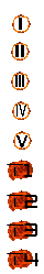
I don't have a problem going for the bf2 or sc2 or u.s mil. symbols. I don't like the color rainbow idea. What about fire?
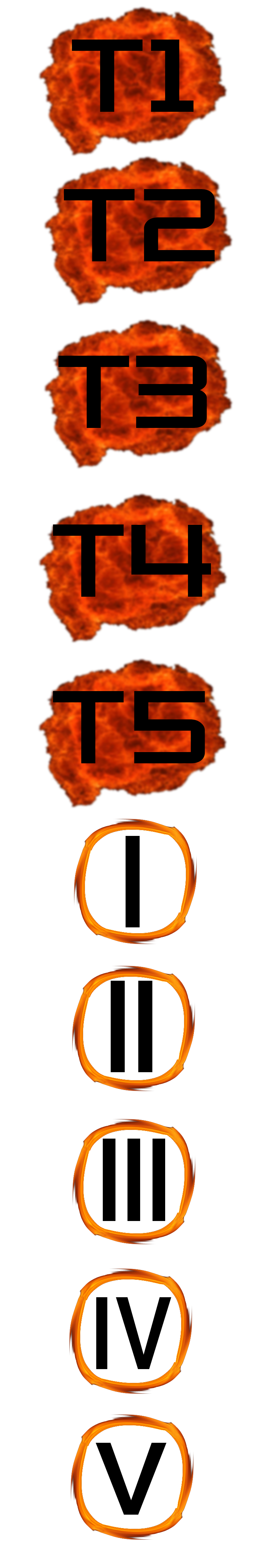
I'm aware that I'm missing t5 as an example, each symbol had to be resized separately, when I resized the large image the roman numerals went transparent. -
@QuantumTyphoon I like the idea but the roman numerals dissappear almost entirely against a black backdrop...
-
I vote for askaholic with some fine tuning colours, it is simple yet clear.
-
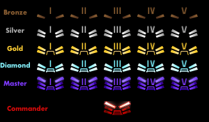
These are 80x40 as 400x200 doesn't translate too well downscaled to 40x20, I asked ftx to use 80x40 instead who asked blackyps/biass who said ok. 400x200 and 40x20 versions are present too.
Sizes comparison (Diamond-1)
400x200
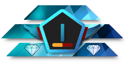
80x40

40x20 (hopefully obsolete in favor of 80x40 but mb useful to have near ava in chat)

All icons in 80x40
Bronze


Silver


Gold


Diamond


Master


Grandmaster (supreme commander is a yikes name)

And the "acu mask" version that kind of turns the icon into an acu face if you have imagination, or you could say its not a face and just a ladder symbol in the middle as well

My personal icon (non-negotiable)

♿ https://www.twitch.tv/petricpwnz ♿
Scientifically proving that Blackheart is a weeb - https://imgur.com/a/J436c | https://clips.twitch.tv/AssiduousAverageOxMikeHogu
-
i think someone won
-
The crown takes the crown? Shame you don't accept the appropriate title of 'Supreme Commander'.
I think the icons are beautiful. I would like to see the 'Master' tier in black/white, but again these look fantastic.
-
@Fremy_Speeddraw Fantastic stuff! There've been some really nice submissions in this thread but I hope yours gets chosen - lovely work.
-
Amazing work Petric!
-
@Fremy_Speeddraw said in Graphic Artist Wanted:
I asked ftx to use 80x40 instead who asked blackyps/biass who said ok.
I'm happy to move the TMM ui around to accomodate these larger icons.
Some questions though:
Have you tried making the numbers not have a gradient/shadow on them so they can be read better?
Also, does this imply anything?

-
I'd like to note that if bigger resolutions are indeed allowed that the description of the original post needs an update
") .
. -
People should just try making a "big version" first if they already made a small one, if it fits with your existing small icon, we can use the two in tandem.
We need a "big version" for the space indicated in the picture, if you have the time, please place your big icon in that space to help showcase your work.
Also as an aside, please make sure your icons work on a black background.
-
@Fremy_Speeddraw Nice classy style. This is mainly created by the black background of the pentagon I think. But this may also be why the numbers are hard to read (40x20 almost not readable for me, but I'm old, also..). Maybe its solved when you delete the gradient on the numbers, but you could also experiment with making the background white or any lighter color. Did you already try?
-
@biass said in Graphic Artist Wanted:
@Fremy_Speeddraw said in Graphic Artist Wanted:
I asked ftx to use 80x40 instead who asked blackyps/biass who said ok.
I'm happy to move the TMM ui around to accomodate these larger icons.
Some questions though:
Have you tried making the numbers not have a gradient/shadow on them so they can be read better?
Also, does this imply anything?
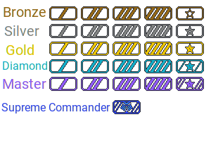
Non gradient light grey looks a bit out of place, non gradient matching color with the icon is read a little better if you make it very light and contrasting but it's at the cost of looking a bit off again (at least in my view), don't think the difference is big overall, is it actually difficult to read the numbers? Shadow makes no readability difference.
The colors are just from some military ribbons I found in google, maybe could give them texture to better portray the idea or make them shine like metal too, but I'm not making any revisions until I at least have confirmations on usage. I also would have some questions regarding implementation.
♿ https://www.twitch.tv/petricpwnz ♿
Scientifically proving that Blackheart is a weeb - https://imgur.com/a/J436c | https://clips.twitch.tv/AssiduousAverageOxMikeHogu
-
For your questions on implementation just contact me.
I talked to biass how we can fit the bigger icons in the team matchmaker ui and we came up with this:
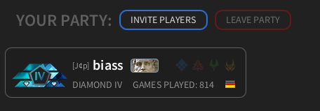
Having 40x20 versions is still useful if we want to make the division icons available as avatars.
I really like your icons, but I don't know if anyone else ist still making some.
So if anyone is still working on a proposal for a different icon set, let me or FtX know as soon as possible. I think a two day grace period should be enough. (You don't need to have them finished by then, but I need to know if there is more to come.)
Hello! It looks like you're interested in this conversation, but you don't have an account yet.
Getting fed up of having to scroll through the same posts each visit? When you register for an account, you'll always come back to exactly where you were before, and choose to be notified of new replies (either via email, or push notification). You'll also be able to save bookmarks and upvote posts to show your appreciation to other community members.
With your input, this post could be even better 💗
Register Login