FAForever Forums
    • Categories
    • Recent
    • Tags
    • Popular
    • Users
    • Groups
    • Login

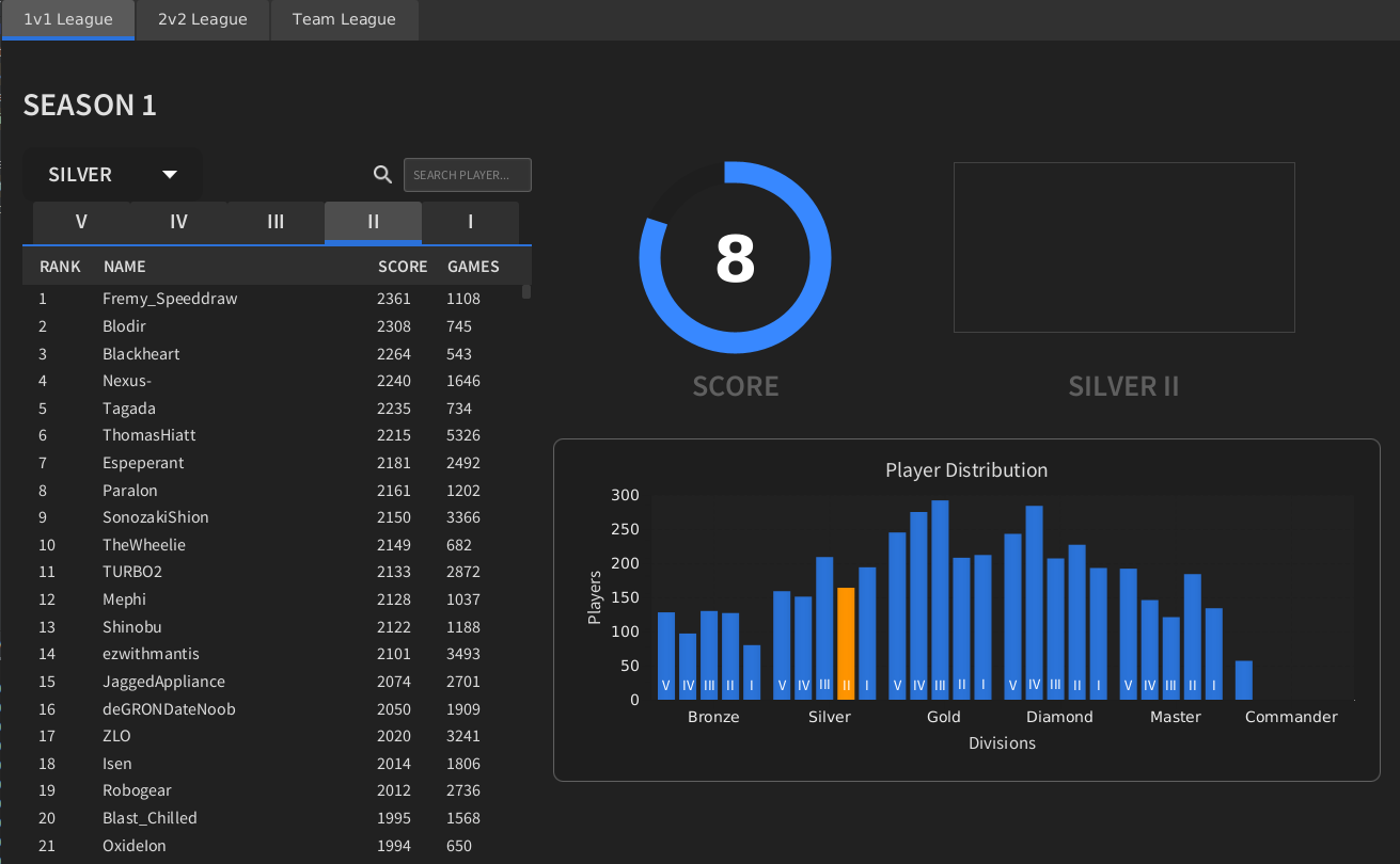
    Graphic Artist Wanted

    Scheduled Pinned Locked Moved General Discussion
    96 Posts 25 Posters 6.6k Views 4 Watching
    Loading More Posts
    • Oldest to Newest
    • Newest to Oldest
    • Most Votes
    Reply
    • Reply as topic
    Log in to reply
    This topic has been deleted. Only users with topic management privileges can see it.
    • tatsuT Offline
      tatsu
      last edited by tatsu

      I'd like to make a new second entry for a second style :

      T1 :
      RankTwo_div1.png RankTwo_div2.png RankTwo_div3.png RankTwo_div4.png RankTwo_div5.png

      T2 :
      New Project(2).pngNew Project(5).pngNew Project(4).pngNew Project(3).pngNew Project(6).png

      T3 :
      RankThree_div1.png RankThree_div2.png RankThree_div3.png RankThree_div4.png RankThree_div5.png

      T4 :
      RankFour_div1.png RankFour_div2.png RankFour_div3.png RankFour_div4.png RankFour_div5.png

      T5 :
      rankFive_div1.pngrankFive_div2.png rankFive_div3.png RankFive_div4.png RankFive_div5.png

      How to setup FAF on linux

      AskaholicA 1 Reply Last reply Reply Quote 1
      • AskaholicA Offline
        Askaholic @tatsu
        last edited by Askaholic

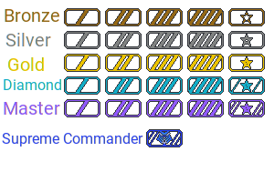
        @tatsu Looks cool but I think just changing the size makes it pretty hard to tell between the sub tiers. Like if you just see one of them you won't be sure if it's tier 2 or 3 because they both look too similar.

        Here's my idea, although I'm not particularly good at the graphics so maybe someone wants to take inspiration from it and come up with their own version, or just use this as a base and make it better. Go for it, you have full permission!
        Rank Icons Idea.png

        Divisions are differentiated by color, sub-divisions are differentiated by the number of stripes or stars and the final tier gets its own special icon. I tried to go for the commander mask, but it could be anything so long as it strikes fear into the hearts of your enemies.

        I guess you need to be careful with colors because of colorblindness, so maybe the border should get progressively more fancy as you go up divisions. Something like

        Bronze -> no border
        Silver -> Top and bottom
        Gold -> Full border plain
        Diamond -> Full border embellished
        Master -> Even more embellished

        Anyway, I've spent too much time making this already 😛

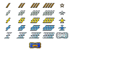
        Edit: I worked on polishing it up and heres what I came up with. I kindof made the mistake of assuming the rank numbers increase as you gain rank, but it's supposed to be the opposite. These icons make more sense if subdivision 5 is the top and 1 is the bottom.
        Rank Icons2.png

        tatsuT 1 Reply Last reply Reply Quote 4
        • biassB Offline
          biass
          last edited by

          I like askaholics ideas, but I wanted to put out the reminder:
          you need to attempt to communicate the fact that metal elements are in fact: metal.

          Otherwise it’s a bit hard to assume people will think bronze is not just “brown” or diamond not “cyan”

          Don’t know why master rank needs to be purple, seems a bit strange and doesn’t hold any significance, if you’re going to add in reflections to communicate the metal, maybe give the purple some blue (or green) shine to make it more of a gemstone? Just a thought

          The old uef acu mask looks absolutely terrible, don’t feel the need to use that. I would try just a basic crown or something easy to communicate

          1 Reply Last reply Reply Quote 0
          • archsimkatA Offline
            archsimkat @GGhost272
            last edited by

            @GGhost272 That looks amazing! I would be motivated to get those to show off.

            1 Reply Last reply Reply Quote 2
            • QuantumTyphoonQ Offline
              QuantumTyphoon @BlackYps
              last edited by

              I don't have a problem going for the bf2 or sc2 or u.s mil. symbols. I don't like the color rainbow idea. What about fire? tiersmall.png tierlarge.png
              I'm aware that I'm missing t5 as an example, each symbol had to be resized separately, when I resized the large image the roman numerals went transparent.

              PhotekP 1 Reply Last reply Reply Quote 0
              • PhotekP Offline
                Photek @QuantumTyphoon
                last edited by

                @QuantumTyphoon I like the idea but the roman numerals dissappear almost entirely against a black backdrop...

                1 Reply Last reply Reply Quote 0
                • The_JanitorT Offline
                  The_Janitor
                  last edited by

                  I vote for askaholic with some fine tuning colours, it is simple yet clear.

                  Analyze, Adapt, Overcome...

                  1 Reply Last reply Reply Quote 0
                  • Fremy_SpeeddrawF Offline
                    Fremy_Speeddraw
                    last edited by

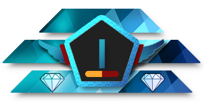
                    These are 80x40 as 400x200 doesn't translate too well downscaled to 40x20, I asked ftx to use 80x40 instead who asked blackyps/biass who said ok. 400x200 and 40x20 versions are present too.

                    Sizes comparison (Diamond-1)

                    400x200
                    Diamond-1.png
                    80x40
                    Diamond-1_medium.png
                    40x20 (hopefully obsolete in favor of 80x40 but mb useful to have near ava in chat)
                    Diamond-1_small.png

                    All icons in 80x40

                    Bronze

                    Bronze-5_medium.png
                    Bronze-4_medium.png
                    Bronze-3_medium.png
                    Bronze-2_medium.png
                    Bronze-1_medium.png

                    Silver

                    Silver-5_medium.png
                    Silver-4_medium.png
                    Silver-3_medium.png
                    Silver-2_medium.png
                    Silver-1_medium.png

                    Gold

                    Gold-5_medium.png
                    Gold-4_medium.png
                    Gold-3_medium.png
                    Gold-2_medium.png
                    Gold-1_medium.png

                    Diamond

                    Diamond-5_medium.png
                    Diamond-4_medium.png
                    Diamond-3_medium.png
                    Diamond-2_medium.png
                    Diamond-1_medium.png

                    Master

                    Master-5_medium.png
                    Master-4_medium.png
                    Master-3_medium.png
                    Master-2_medium.png
                    Master-1_medium.png

                    Grandmaster (supreme commander is a yikes name)

                    Grandmaster-Crown_medium.png

                    And the "acu mask" version that kind of turns the icon into an acu face if you have imagination, or you could say its not a face and just a ladder symbol in the middle as well

                    Grandmaster-ACU-Face_medium.png

                    My personal icon (non-negotiable)

                    Fremy_Speeddraw_medium.png

                    ♿ https://www.twitch.tv/petricpwnz ♿

                    Scientifically proving that Blackheart is a weeb - https://imgur.com/a/J436c | https://clips.twitch.tv/AssiduousAverageOxMikeHogu

                    G biassB QuantumTyphoonQ 3 Replies Last reply Reply Quote 12
                    • AzraaaA Offline
                      Azraaa
                      last edited by

                      i think someone won

                      Developer for LOUD Project | https://discord.gg/DfWXMg9
                      AI Development FAF Discord | https://discord.gg/ChRfhB3
                      AI Developer for FAF

                      Community Manager for FAF
                      Member of the FAF Association
                      FAF Developer

                      1 Reply Last reply Reply Quote 0
                      • PhotekP Offline
                        Photek
                        last edited by

                        The crown takes the crown? Shame you don't accept the appropriate title of 'Supreme Commander'.

                        I think the icons are beautiful. I would like to see the 'Master' tier in black/white, but again these look fantastic.

                        1 Reply Last reply Reply Quote 0
                        • G Offline
                          GGhost272 @Fremy_Speeddraw
                          last edited by

                          @Fremy_Speeddraw Fantastic stuff! There've been some really nice submissions in this thread but I hope yours gets chosen - lovely work.

                          1 Reply Last reply Reply Quote 0
                          • T Offline
                            Tagada Balance Team
                            last edited by

                            Amazing work Petric!

                            1 Reply Last reply Reply Quote 0
                            • biassB Offline
                              biass @Fremy_Speeddraw
                              last edited by

                              @Fremy_Speeddraw said in Graphic Artist Wanted:

                              I asked ftx to use 80x40 instead who asked blackyps/biass who said ok.

                              I'm happy to move the TMM ui around to accomodate these larger icons.

                              Some questions though:

                              Have you tried making the numbers not have a gradient/shadow on them so they can be read better?

                              Also, does this imply anything?
                              alt text

                              Fremy_SpeeddrawF 1 Reply Last reply Reply Quote 0
                              • JipJ Offline
                                Jip
                                last edited by Jip

                                I'd like to note that if bigger resolutions are indeed allowed that the description of the original post needs an update 🙂 .

                                A work of art is never finished, merely abandoned

                                1 Reply Last reply Reply Quote 0
                                • biassB Offline
                                  biass
                                  last edited by

                                  People should just try making a "big version" first if they already made a small one, if it fits with your existing small icon, we can use the two in tandem.

                                  We need a "big version" for the space indicated in the picture, if you have the time, please place your big icon in that space to help showcase your work.

                                  Also as an aside, please make sure your icons work on a black background.

                                  1 Reply Last reply Reply Quote 0
                                  • ? Offline
                                    A Former User
                                    last edited by

                                    @Fremy_Speeddraw Nice classy style. This is mainly created by the black background of the pentagon I think. But this may also be why the numbers are hard to read (40x20 almost not readable for me, but I'm old, also..). Maybe its solved when you delete the gradient on the numbers, but you could also experiment with making the background white or any lighter color. Did you already try?

                                    1 Reply Last reply Reply Quote 0
                                    • Fremy_SpeeddrawF Offline
                                      Fremy_Speeddraw @biass
                                      last edited by Fremy_Speeddraw

                                      @biass said in Graphic Artist Wanted:

                                      @Fremy_Speeddraw said in Graphic Artist Wanted:

                                      I asked ftx to use 80x40 instead who asked blackyps/biass who said ok.

                                      I'm happy to move the TMM ui around to accomodate these larger icons.

                                      Some questions though:

                                      Have you tried making the numbers not have a gradient/shadow on them so they can be read better?

                                      Also, does this imply anything?
                                      alt text

                                      Non gradient light grey looks a bit out of place, non gradient matching color with the icon is read a little better if you make it very light and contrasting but it's at the cost of looking a bit off again (at least in my view), don't think the difference is big overall, is it actually difficult to read the numbers? Shadow makes no readability difference.

                                      The colors are just from some military ribbons I found in google, maybe could give them texture to better portray the idea or make them shine like metal too, but I'm not making any revisions until I at least have confirmations on usage. I also would have some questions regarding implementation.

                                      ♿ https://www.twitch.tv/petricpwnz ♿

                                      Scientifically proving that Blackheart is a weeb - https://imgur.com/a/J436c | https://clips.twitch.tv/AssiduousAverageOxMikeHogu

                                      BlackYpsB AskaholicA 2 Replies Last reply Reply Quote 0
                                      • BlackYpsB Offline
                                        BlackYps @Fremy_Speeddraw
                                        last edited by

                                        For your questions on implementation just contact me.

                                        I talked to biass how we can fit the bigger icons in the team matchmaker ui and we came up with this:
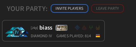
                                        589eaa3d-46de-458f-97d9-59adad798108-grafik.png

                                        Having 40x20 versions is still useful if we want to make the division icons available as avatars.

                                        I really like your icons, but I don't know if anyone else ist still making some.
                                        So if anyone is still working on a proposal for a different icon set, let me or FtX know as soon as possible. I think a two day grace period should be enough. (You don't need to have them finished by then, but I need to know if there is more to come.)

                                        1 Reply Last reply Reply Quote 0
                                        • AskaholicA Offline
                                          Askaholic @Fremy_Speeddraw
                                          last edited by Askaholic

                                          Those look awesome. One thing I've been thinking about though are the roman numerals, as a lot of ideas have included them, but I am not convinced that they're the way to go.

                                          The issue I have is that their progression doesn't make sense visually. Like, we go from additional lines meaning higher number: I, II, III, to all of a sudden fewer lines meaning higher number: IV, V. It kindof breaks with the whole idea of having more stuff mean higher number. You can see in @tatsu's first submission that the IV has to get squeezed in with a smaller font in order to fit in the same space. Plus when you read roman numerals like IV, you are forced to do math in your head: "lets see... IV means I -> 1 and V -> 5 so I need to swap the order and subtract 5-1=4!". And sure, you can expect most people to just have this memorized because of experience, but I just feel like there must be a more intuitive way to represent the tier than roman numerals.

                                          For example here is a little modification I threw together in a few minutes:
                                          diamond-modified-2.png
                                          I think it's pretty clear what each of those means without me needing to explain anything, and actually looks pretty good too (ignoring the sloppiness). No need to do math as our brains are naturally able to count objects (up to about 7 or 8 I believe). It could be any object really, stripes or diamonds, or circles; I just thought the 5 pointed star fit nicely inside of the pentagon.

                                          @biass thoughts?

                                          biassB 1 Reply Last reply Reply Quote 1
                                          • Mvk_-M Offline
                                            Mvk_- Banned @tatsu
                                            last edited by

                                            @tatsu

                                            Tier 1 , <-- Does this need or can have an icon also??
                                            Subdivision 1
                                            etc

                                            Thanks

                                            1 Reply Last reply Reply Quote 0
                                            • First post
                                              Last post