Feedback for the new client Newshub needed!
-
Hello everyone! As some of you may know, I've been working on the website 4.0 (with help from Rowey). Now we are working on the news and I got some exciting news! The client newshub MIGHT (maybe, not 100% sure, etc) receive an update soon because guess what, its just one page in the website. Therefore, it could be a lot easier to implement the new newshub without affecting the current website.
Anyhow, I want your feedback on what you want to see on it, you want to see a map of the week? developer of the month? What sort of feature/thing do you want to see when you open the FAF client?
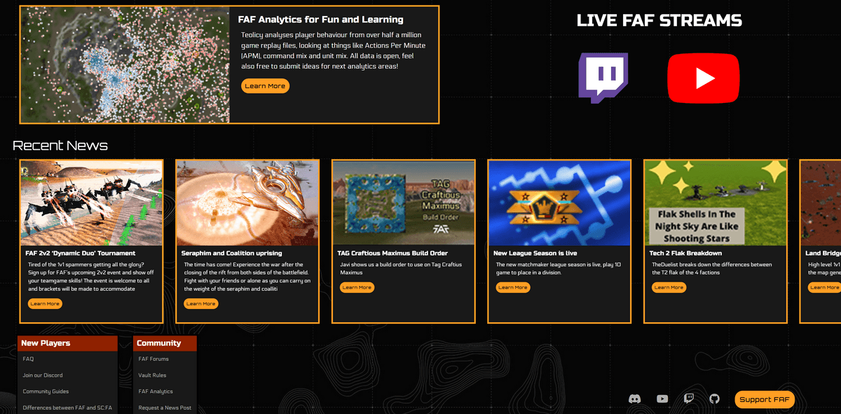
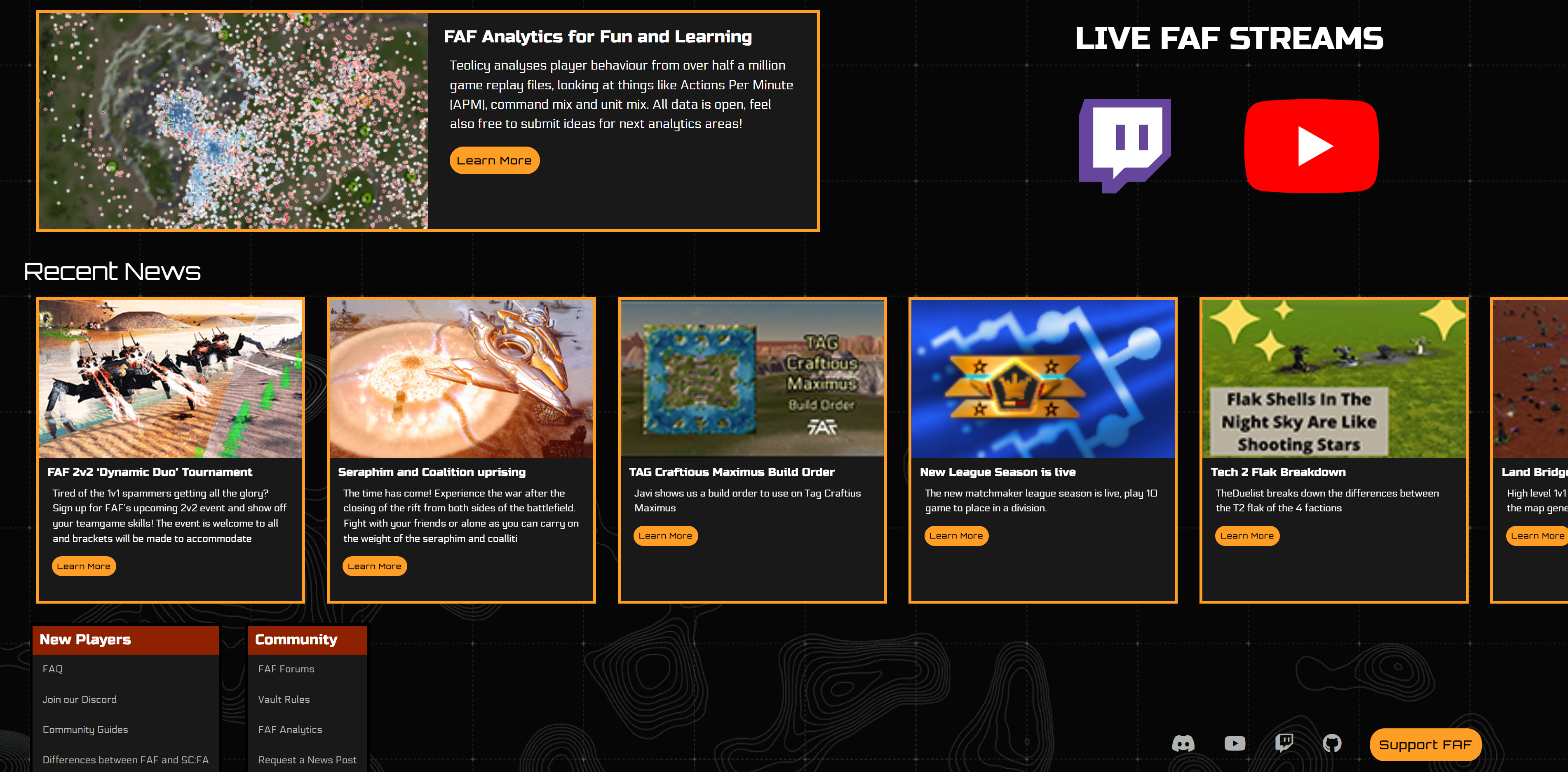
Here is a WIP (Work in Progress) image of what I currently have, I'm still working on it and yes some stuff is out of place or missing a background etc. But the design will be something along these lines.
So please, throw your feedback at me, no matter how harsh it is, I welcome all feedback so I can create a newshub that the community likes and wants to see.
Thanks.
TLDR: What do you want to see on the newshub? Map of the week? Dev of the month? Times dualgap has been played? etc.
-
Borders, outlines, whatever. STOP using them, or use some darker color. Orange make to much contrast compared to bg
And I remember, they said, client-based design. No?
Also, your newshub missing place for posters
-
There was a design made by a designer, see also:
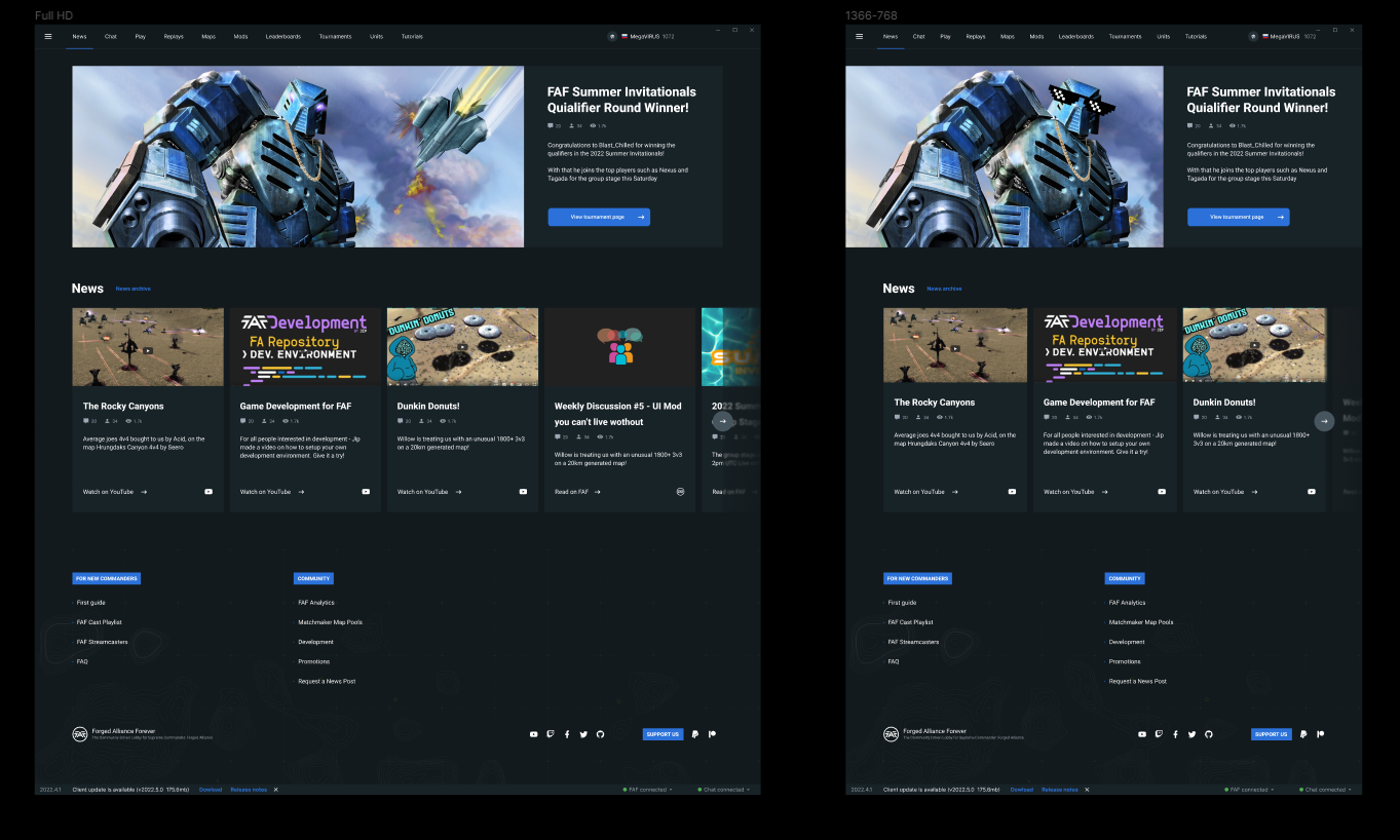
Please stick closer to it - it looks very refreshing and modern.
A work of art is never finished, merely abandoned
-
@jip Where did you find this?
-
@eternal internal messages with a designer
-
@jip you also have to remember the client shows a webpage so it also need to fit in with the theme of the website other wise if you stumbled across it on the website itself it would be a complete different contrast.
-
Then the designer we asked to design the news hub should've been made aware of that. He's doing this for his resume
") . Also, the designer is @MegaVIRUS
. Also, the designer is @MegaVIRUSA work of art is never finished, merely abandoned
-
We can have a different design on the website and then we simply don't link to the newshub the client uses
-
@jip then the guy making the newshub should have been made aware so the designer knows what the color scheme is being used. Don't know why I wasn't consulted for this if I'm the main developer of the new website?
Also the design is very square, it wont work well with a 16:9 screen, the featured image will get stretched out. Besides, the design I made is very close to the one made by the designer (and please remember, it is a WIP, not a final design).
But, I won't make it blue, it doesn't match the current color scheme of the newshub and again, I wasn't consulted for this. If I had been consulted and agreed to use what the designer made, then for sure I'd make it just like his design.
FAF Website Developer
-
@eternal I agree, the outline can be darker. Posters won't be a thing in the new newshub anymore. No use for it.
-
@javi it is not about color scheme. The color can be changed
Hello! It looks like you're interested in this conversation, but you don't have an account yet.
Getting fed up of having to scroll through the same posts each visit? When you register for an account, you'll always come back to exactly where you were before, and choose to be notified of new replies (either via email, or push notification). You'll also be able to save bookmarks and upvote posts to show your appreciation to other community members.
With your input, this post could be even better 💗
Register Login