FAForever Forums
    • Categories
    • Recent
    • Tags
    • Popular
    • Users
    • Groups
    • Login

    Graphic Artist Wanted

    Scheduled Pinned Locked Moved General Discussion
    96 Posts 25 Posters 6.6k Views 4 Watching
    Loading More Posts
    • Oldest to Newest
    • Newest to Oldest
    • Most Votes
    Reply
    • Reply as topic
    Log in to reply
    This topic has been deleted. Only users with topic management privileges can see it.
    • BlackYpsB Offline
      BlackYps
      last edited by

      Can you rephrase that?

      Mvk_-M 1 Reply Last reply Reply Quote 0
      • Mvk_-M Offline
        Mvk_- Banned @BlackYps
        last edited by

        @BlackYps Icons from more than one person entering icons to be used, say multiple winners.

        1 Reply Last reply Reply Quote 0
        • BlackYpsB Offline
          BlackYps
          last edited by

          Sure, that's possible. This is not a competition. But it's an unlikely scenario, because the style should be consistent.

          1 Reply Last reply Reply Quote 0
          • tatsuT Offline
            tatsu
            last edited by tatsu

            I mean it's not entirely out of the question either.

            look at what happened with FAF achievements : @Exotic_Retard drew a couple bases and I turned some of those into a couple other bases, tweaked them a bit, used that full compilation of bases and added the innards.

            The achievements as they stand today are a collaboration between me and Exotic.

            How to setup FAF on linux

            1 Reply Last reply Reply Quote 0
            • RoweyR Offline
              Rowey
              last edited by

              arnt they jsut a rip from the Council Badges kinda ?

              "The needs of the many outweigh the needs of the few" - Spock

              1 Reply Last reply Reply Quote 0
              • tatsuT Offline
                tatsu
                last edited by

                yup.

                although....

                • the council badges have a ribbon that ends in a cut tip
                • they have three ribbons (two more)
                • they have a thicker ribbon (except for tier 5 and tier 6, which is thicker)
                • they have the faf logo which occupies more space in the center and make them pop more thanks to all that volume of color.

                overall I feel like these defer to the council badges whilst harboring a theme for badges as a whole.

                How to setup FAF on linux

                1 Reply Last reply Reply Quote 0
                • Mvk_-M Offline
                  Mvk_- Banned
                  last edited by

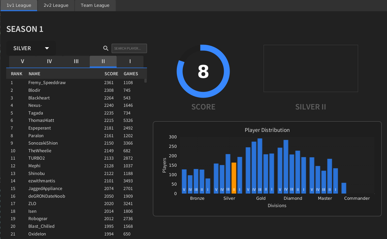
                  Do the tiers themselves need icons also or just the subdivisions?

                  1 Reply Last reply Reply Quote 0
                  • tatsuT Offline
                    tatsu
                    last edited by tatsu

                    @Mvk_- for the 20x40 or the 200x400 versions?

                    How to setup FAF on linux

                    Mvk_-M 1 Reply Last reply Reply Quote 0
                    • FtXCommandoF Offline
                      FtXCommando
                      last edited by

                      What tatsu did is what we would need.

                      1 Reply Last reply Reply Quote 1
                      • G Offline
                        GGhost272
                        last edited by

                        Should there be a background for them (eg. a colour backdrop behind the icon)? Tempted to have a go at this when I have some spare time

                        1 Reply Last reply Reply Quote 0
                        • archsimkatA Offline
                          archsimkat
                          last edited by

                          This post is deleted!
                          1 Reply Last reply Reply Quote 0
                          • G Offline
                            GGhost272
                            last edited by GGhost272

                            I came up with these, tried to go for a UEF commander look. I had a lot of fun making them!

                            faf rank concepts small.png

                            EDIT: Slightly improved(?) version!

                            faf rank concepts small v2.png

                            PhotekP archsimkatA 2 Replies Last reply Reply Quote 7
                            • PhotekP Offline
                              Photek @GGhost272
                              last edited by

                              @GGhost272 Like a sequentially upgrading mask, very cool!

                              1 Reply Last reply Reply Quote 1
                              • tatsuT Offline
                                tatsu
                                last edited by tatsu

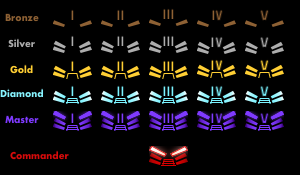
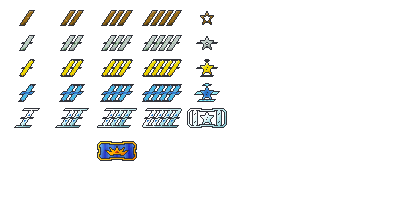
                                I'd like to make a new second entry for a second style :

                                T1 :
                                RankTwo_div1.png RankTwo_div2.png RankTwo_div3.png RankTwo_div4.png RankTwo_div5.png

                                T2 :
                                New Project(2).pngNew Project(5).pngNew Project(4).pngNew Project(3).pngNew Project(6).png

                                T3 :
                                RankThree_div1.png RankThree_div2.png RankThree_div3.png RankThree_div4.png RankThree_div5.png

                                T4 :
                                RankFour_div1.png RankFour_div2.png RankFour_div3.png RankFour_div4.png RankFour_div5.png

                                T5 :
                                rankFive_div1.pngrankFive_div2.png rankFive_div3.png RankFive_div4.png RankFive_div5.png

                                How to setup FAF on linux

                                AskaholicA 1 Reply Last reply Reply Quote 1
                                • AskaholicA Offline
                                  Askaholic @tatsu
                                  last edited by Askaholic

                                  @tatsu Looks cool but I think just changing the size makes it pretty hard to tell between the sub tiers. Like if you just see one of them you won't be sure if it's tier 2 or 3 because they both look too similar.

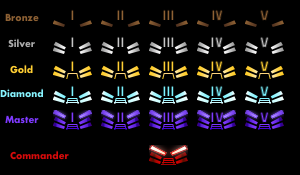
                                  Here's my idea, although I'm not particularly good at the graphics so maybe someone wants to take inspiration from it and come up with their own version, or just use this as a base and make it better. Go for it, you have full permission!

                                  Rank Icons Idea.png

                                  Divisions are differentiated by color, sub-divisions are differentiated by the number of stripes or stars and the final tier gets its own special icon. I tried to go for the commander mask, but it could be anything so long as it strikes fear into the hearts of your enemies.

                                  I guess you need to be careful with colors because of colorblindness, so maybe the border should get progressively more fancy as you go up divisions. Something like

                                  Bronze -> no border
                                  Silver -> Top and bottom
                                  Gold -> Full border plain
                                  Diamond -> Full border embellished
                                  Master -> Even more embellished

                                  Anyway, I've spent too much time making this already 😛

                                  Edit: I worked on polishing it up and heres what I came up with. I kindof made the mistake of assuming the rank numbers increase as you gain rank, but it's supposed to be the opposite. These icons make more sense if subdivision 5 is the top and 1 is the bottom.
                                  Rank Icons2.png

                                  tatsuT 1 Reply Last reply Reply Quote 4
                                  • biassB Offline
                                    biass
                                    last edited by

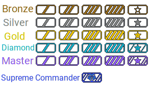
                                    I like askaholics ideas, but I wanted to put out the reminder:
                                    you need to attempt to communicate the fact that metal elements are in fact: metal.

                                    Otherwise it’s a bit hard to assume people will think bronze is not just “brown” or diamond not “cyan”

                                    Don’t know why master rank needs to be purple, seems a bit strange and doesn’t hold any significance, if you’re going to add in reflections to communicate the metal, maybe give the purple some blue (or green) shine to make it more of a gemstone? Just a thought

                                    The old uef acu mask looks absolutely terrible, don’t feel the need to use that. I would try just a basic crown or something easy to communicate

                                    1 Reply Last reply Reply Quote 0
                                    • archsimkatA Offline
                                      archsimkat @GGhost272
                                      last edited by

                                      @GGhost272 That looks amazing! I would be motivated to get those to show off.

                                      1 Reply Last reply Reply Quote 2
                                      • QuantumTyphoonQ Offline
                                        QuantumTyphoon @BlackYps
                                        last edited by

                                        I don't have a problem going for the bf2 or sc2 or u.s mil. symbols. I don't like the color rainbow idea. What about fire? tiersmall.png tierlarge.png
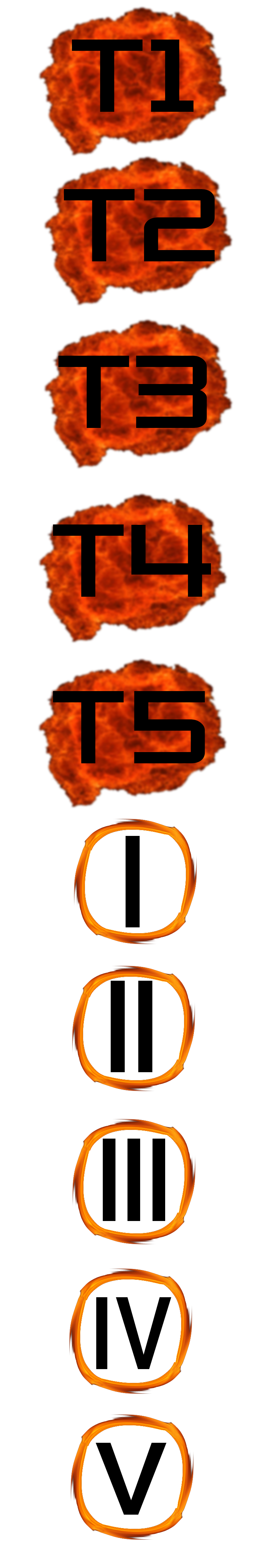
                                        I'm aware that I'm missing t5 as an example, each symbol had to be resized separately, when I resized the large image the roman numerals went transparent.

                                        PhotekP 1 Reply Last reply Reply Quote 0
                                        • PhotekP Offline
                                          Photek @QuantumTyphoon
                                          last edited by

                                          @QuantumTyphoon I like the idea but the roman numerals dissappear almost entirely against a black backdrop...

                                          1 Reply Last reply Reply Quote 0
                                          • The_JanitorT Offline
                                            The_Janitor
                                            last edited by

                                            I vote for askaholic with some fine tuning colours, it is simple yet clear.

                                            Analyze, Adapt, Overcome...

                                            1 Reply Last reply Reply Quote 0
                                            • First post
                                              Last post