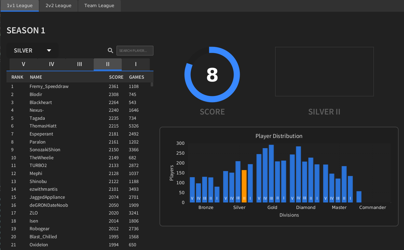
Graphic Artist Wanted
-
any suggestions or criticisms.
-
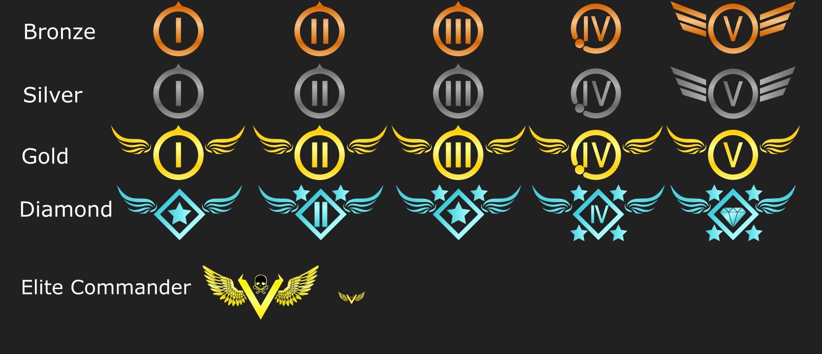
Oohh, I like how you used the tech icons of Supreme Commander. But perhaps do not evolve to wings or eagles? It is very amerika-isch. Perhaps you can remain in the 'flow' of Supreme Commander by using silhouettes of units as the fifth level.
A work of art is never finished, merely abandoned
-
@Jip I'd partially agree, maybe a division or two in each tier can have wings or say be swept by, not sure all.
I'm for unit icons myself, seems more for just FAF .
Thanks
-
@Mvk_
yeah, I might have overdone it with the wings but it seemed like the only thing that fit with the design I was going for. I also wanted to make sure you felt rewarded when ranking up, I felt that everything above silver had to have something unique to them while also feeling somewhat similar hence they naturally kinda just all got wings (early designs had no wings at all).As for the unit idea, I actually tried something like that. Each tier was actually a unit and as you ranked up the higher tier unit you got with 5 being an ACU but ultimately my subpar graphic skills weren't enough and I just couldn't make it work and it honestly did not look good at all. Plus there is the small issue of people complaining that their faction isn't a higher tier.
-
But perhaps do not evolve to wings or eagles? It is very amerika-isch.
Eagles have been around in heraldry for ages, it's not America specific. Especially since they were inspired by the Romans...
-
@Burritozilla The design fits as you say. They would be reasonable to have.
I'm stuck on Unit/Buildings Icons.
Yes, there will be faction conflicts for higher tiers but in the end is just a faction to say for the tier.
There are probably least a couple solutions for such and still having unit/building Icons in the tiers before, but some work would be involved.I've done some reasonable work with concepts before to the ideas of alot of the submissions to say already put here for this thread and topic.
Units/Buildings are done often actually just not all the time in a graphical sense for the reasons here.20x40 is the mark to find, 200x400 is a reasonable signature size, alot of work is reasonable there. The mark to find is not as much to look for but is within reason to maybe search out for 200x400, I did alot of 150x500 size ranges before for signatures.
Units/Buildings would nice but not sure will be presented in time.
Thanks
-
@Burritozilla Nice and simple and looks good. A few things:
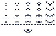
- According to the main post, subivision 5 is the lowest and 1 is the highest (I made this mistake too on my attempt)
- Again I don't like the roman numerals, see my earlier post.
- On gold 4-5 the design gets simpler, makes it feel that 4 is better
- Diamond is really inconsistent. I like where you are going with getting rid of the roman numerals, you should fully commit to it and get rid of roman numerals in 2 and 4 as well. (And for that matter get rid of roman numerals entirely)
-
Just a general observation: If something is not readable in monochrome or greyscale, it won't be readable in colour. In other words, don't let colour do your design work for you.
-
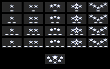
ETA: I just re-read the thread. The tiers 1-5 with 5 being the lowest make this somewhat unintuitive

Need to think of something else
-
Invert it??
Thanks
-
Liek dis?
-
Invert outside colors, like flipping it backwards, but inside out if not mistaken.
Thanks
-
I really don't follow what you mean?
-
I know its not an option is alot of image producing and editing programs and apps, but fairly certain photoshop has it, maybe not be called invert but i seem to recall it that way.
Basically the prior concepts needs to be flipped and and set backwards, invert could do something similar in just say one command.
Might need some work still, but could work though also. I might try to run PS again and check and see but not sure.
I tried to find an old assets disc and couldnt find it, I had tons of psds on it. Almost several gbs worth. One thing i did was basically nothing but of say the invert flip command essentially.Thanks
-
Yea with 5 being the lowest I think you have to make the size of the stars increase as the number of them decreases. So you start with 5 small ones and work your way up to 1 large one.
-


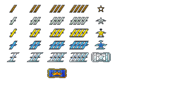
Quick made icon, but units still seem reasonable, but again, does seem like would take some reasonable time.

-
-
@Askaholic said in Graphic Artist Wanted:
this is fun...
why did you go for pixel-perfect though?
I know it's like the whole shtick of supreme commander strat icons but your task is the opposite of the strat icons, the strat icons need to transmit a lot of data, your goal is to make these avatars look nice.
I think there's a real diamond in the rough here. let's try and see what this would look like with non-pixel perfect/shaded pixels.
the issue I have for example it that the stars all look lopsided because of the pixels that should be smack dab in the middle of two screen pixels to be correctly positioned for the correct angle
and the bars come off jagged and as a result, kinda fuzzy whereas I'm sure you wanted them to on the contrary have a clearly marked/cut style, for a more serious effect.
-
@Whatsisname said in Graphic Artist Wanted:
The tiers 1-5 with 5 being the lowest
is this really set in stone?
I don't think counting down as you go up in tiers is better....
we really need to stop it with this pseudo-clever stuff on faf (looks at the cpu score) it's really counter intuitive to most new fafers
-
I'm a fair Tier vs Tech person. Tier going lower for higher and higher for lower does make sense.
But if you check, not sure still is. But T for T1, T2, etc is listed as Tech 1 etc in game, I noticed that after getting FA installed awhile back but not sure if was updated or not. But Supcom did start out with Tier and I'm certain FA did as well, just not sure if either stayed that way.
But in terms of Tiers for the work, is really Subdivisions within a tier also, which again on rankings at a time, lower being higher and higher being lower makes sense.The idea for here is a change for me though also, despite that difference, and I have to relist my listing for division layouts also but only about 15% done of the initial concept and rather I try to keep the icon above to further work on, I don't know, I have no other works in progress either also, so.
Thanks
Hello! It looks like you're interested in this conversation, but you don't have an account yet.
Getting fed up of having to scroll through the same posts each visit? When you register for an account, you'll always come back to exactly where you were before, and choose to be notified of new replies (either via email, or push notification). You'll also be able to save bookmarks and upvote posts to show your appreciation to other community members.
With your input, this post could be even better 💗
Register Login