FAF Website 4.0 on the way!

-
Nice, looks like you spent an age there. I was looking at the designs the other day and it made me think what the purpose of the website even is. Seems like there are three choices here:
a) its for FAF players and should have good content for faf players (eg newshub)
b) its for Supreme Commander players who play on Steam but not FAF. In which case you would emphasise the things FAF has that Steam doesn't, like Ladder.
c) its for people who like RTS but not Supcom yet - in which case you would explain how it has experimentals and flow based economy.Anyway what I really came here to write was in case you are aiming for (b) then have a quick look at my list that I assembled earlier, it might help.
https://youtu.be/VKnq3yoSYGo?t=4146I'm a fan of B myself because steam always gets a new wave of supcom players. Would be nice to suck more into FAF.
-
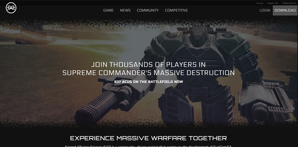
Hello! It's been around a month and a half since my last update! I re-did a couple of things here and there. Currently, the "core" of the landing page is done. It still needs some polishing here and there.
If you are reading this, please visit https://femboyjavi.github.io/ and tell me your thoughts! Specially wording used or images. A couple of areas need a bit more development but I'd like some feedback before I continue to work on this.
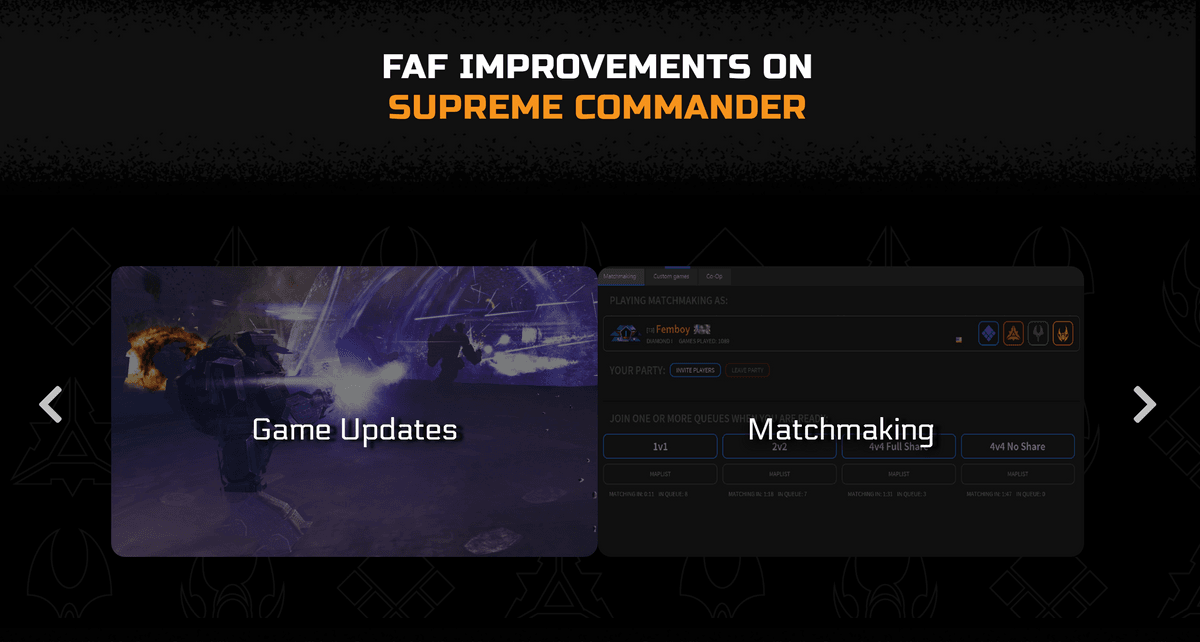
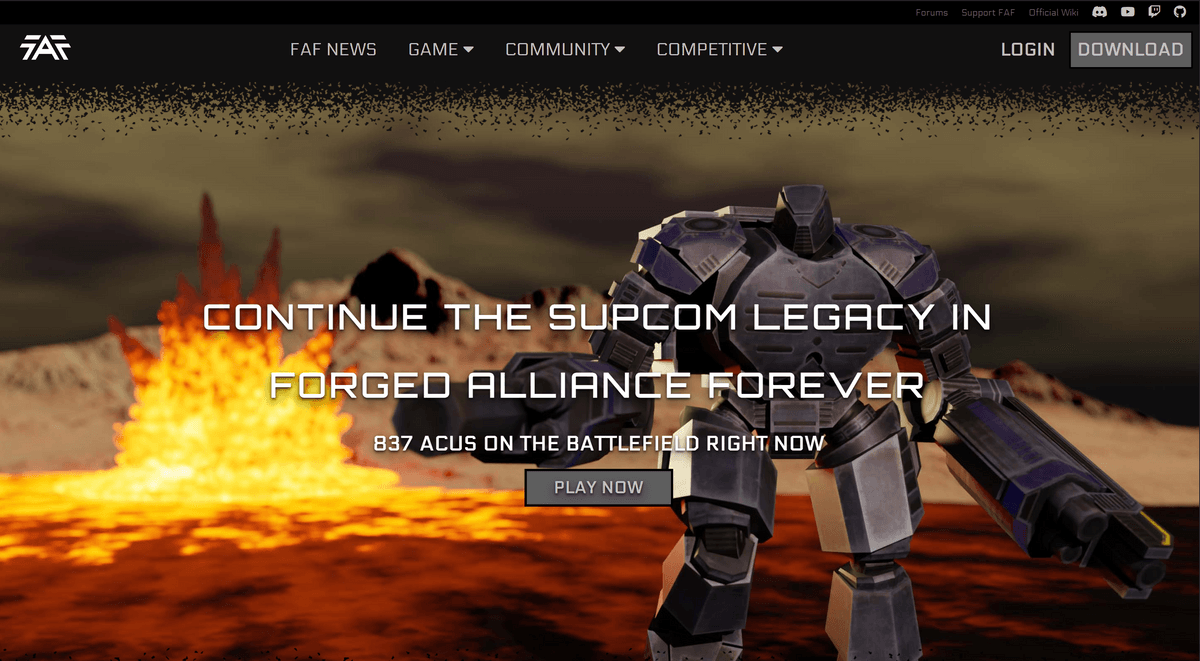
Another big issue is the FAF improvements section, I'd enjoy feedback regarding the "sections"/improvements selected, do you agree with this selection or do you believe it should be different?
Currently, I'm thinking of polishing the landing page more and starting to develop other pages and see how it goes!
-
@femboy
Looking good, a few initial thoughts (some of which will just personal preferences that I expect others may disagree on)- FAF improvements section - Currently only 2 'boxes' show and I have to click on the arrows left+right to see the others. I'd suggest trying to instead have them all visible on the screen (either at once or scrollable) so the user doesnt need to take an action to see the others. E.g. one option would be a grid of smaller 'boxes' with the pictures/titles that still have the 'show more information on mouse-over' approach you've taken; An alternative would be the current website approach where they're shown one by one in a scrollable list.
- Links at the top - I'd have a link to the forum under community (I know it's linked in a separate title even further above but this is much smaller and harder to see, so I'd suggest adding to community instead of or in addition to the mini-menu)
- Introductory text - use "Supreme Commander: Forged Alliance" instead of SupCom:FA (not everyone will be familiar with the abbreviation)
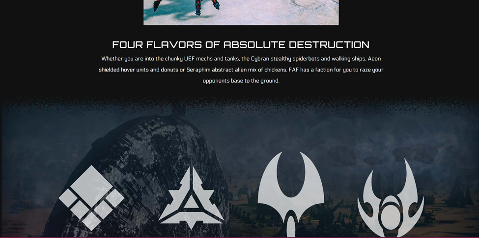
- 4 faction columns - these light up when moving the mouse over - is it planned to add summary text/overview of the faction to each of these and/or a link to somewhere that gives more information on that particular faction?
- The reference to "Competitive queues" as one of the features - would "Automatic matchmaking and custom games" be clearer re what this is referring to?
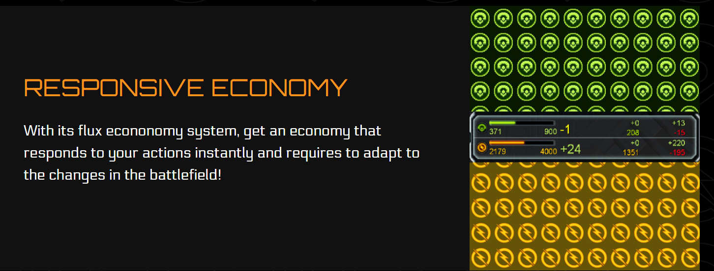
- Flux economy - The rows of mass and energy icons doesn't look good to me, but I'm not sure what would make a better replacement (Although I'd prefer just showing the resource bar in isolation over the resource bar with a backdrop of mass and energy icons)
Edit: In terms of the game improvements noted, I recall seeing figures that showed Co-op was the most popular FAF mode outside of global (more popular than 1v1 ladder), so whether this warrants its own separate 'improvement' section rather than being a part of the game updates?
E.g. Ability to play both the 18? original Supreme Commander missions and 6? forged alliance missions solo or with up to x people online; New custom missions including a Seraphim campaign; Improvements to the campaign missions to provide a greater challenge at harder difficulties
M27AI and M28AI developer; Devlogs and more general AI development guide:
https://forum.faforever.com/topic/2373/ai-development-guide-and-m27ai-v71-devlog
https://forum.faforever.com/topic/5331/m28ai-devlog-v130 -
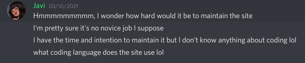
Please rework the header background image. It looks super odd. The picture is blurry and washed out and looks worse than the ingame graphics
"Nerds have a really complicated relationship with change: Change is awesome when WE'RE the ones doing it. As soon as change is coming from outside of us it becomes untrustworthy and it threatens what we think of is the familiar."
– Benno Rice -
@brutus5000 killing Gieb in one sentence (Gieb made that pic, I think it looks pretty nice)
-
@maudlin27 I do know only two boxes show, it was meant like that since if I had 6 boxes showing all at once, I believed it would add a lot of length to it. I'm not sure if I could make it scrollable, it could be tried.
I think I can just keep Forums in both community and at the top.
Yes! I have plans of adding a better image / animation to the 4 faction columns. currently they are a bit barebones. I'm thinking of adding a "Learn More" button after clicking one of them.
I'll give Co-op it's own tab then, thanks a lot for the feedback!
-
Just to Note All text and Content is Subject to Decisions Made at the FAF General Meeting. No content is final and wording may change
")
-
@brutus5000 said in FAF Website 4.0 on the way!:
Please rework the header background image. It looks super odd. The picture is blurry and washed out and looks worse than the ingame graphics
Ouch

It was a quick job. The blur is depth of field, to draw focus to the acu (and hide the ugliness of the rest of the scene). I'm impartial on it being on the website.Here is the original:
https://i.imgur.com/ARUEBAG.jpeg -
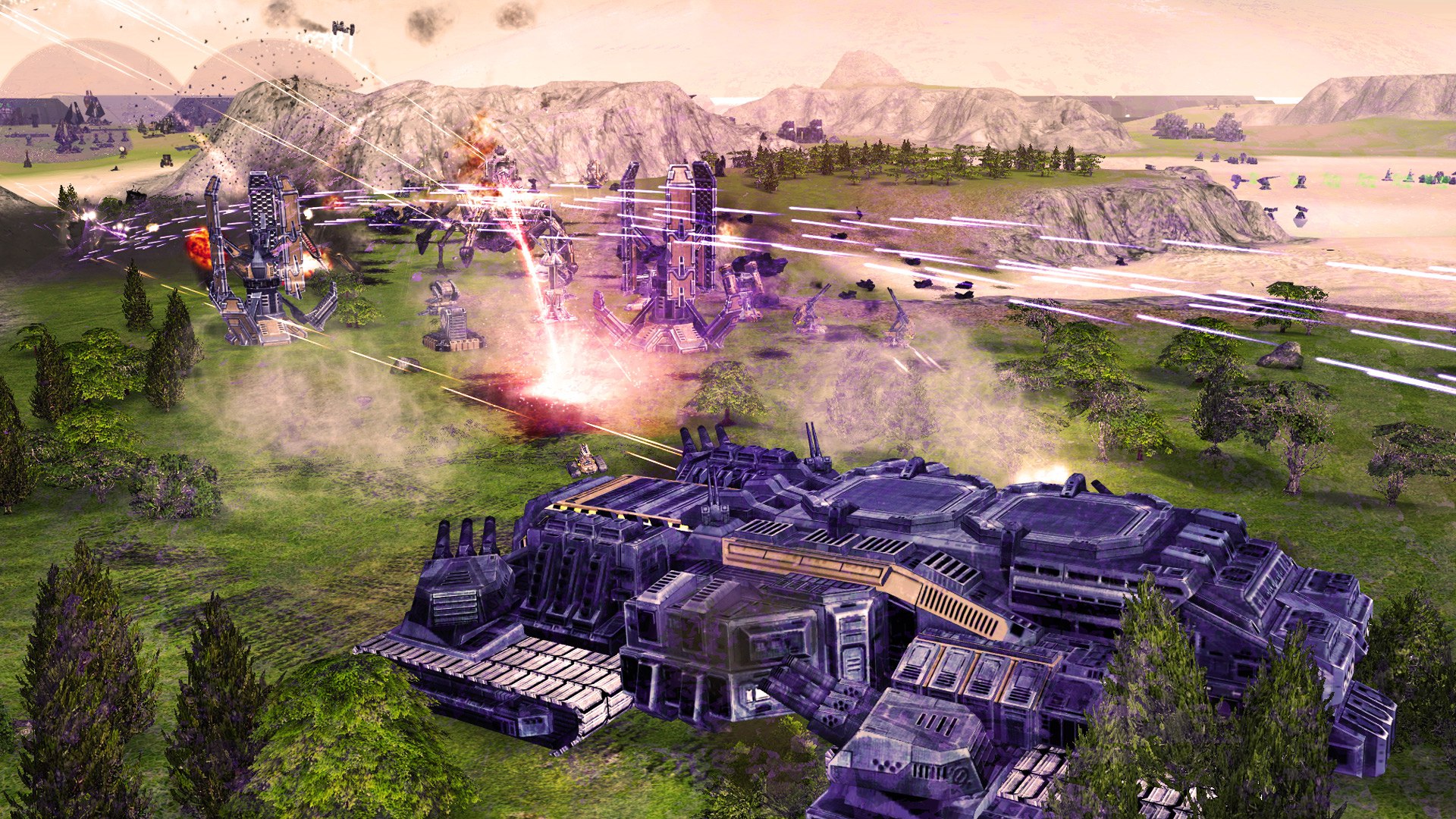
Yeah it's not your effects that make it horrible, but rather the background that looks like map backgrounds from Quake3 or UT in 1999

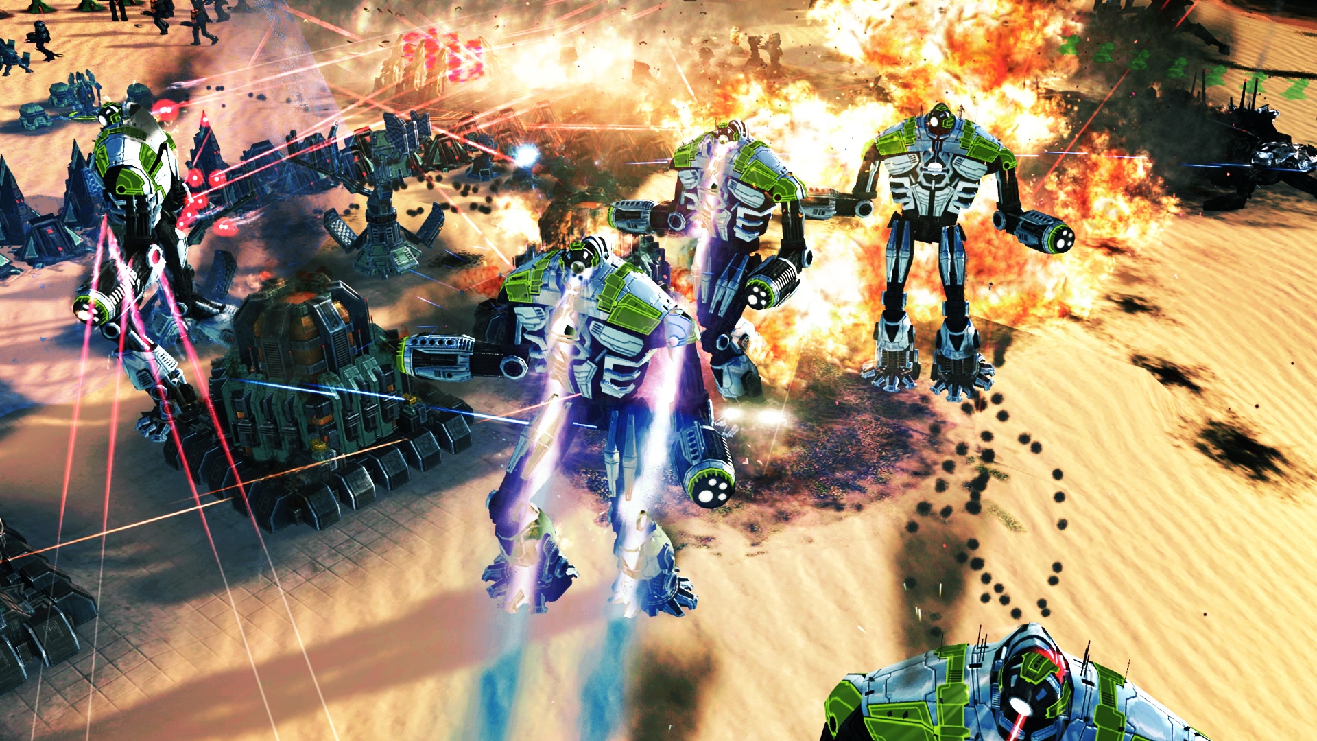
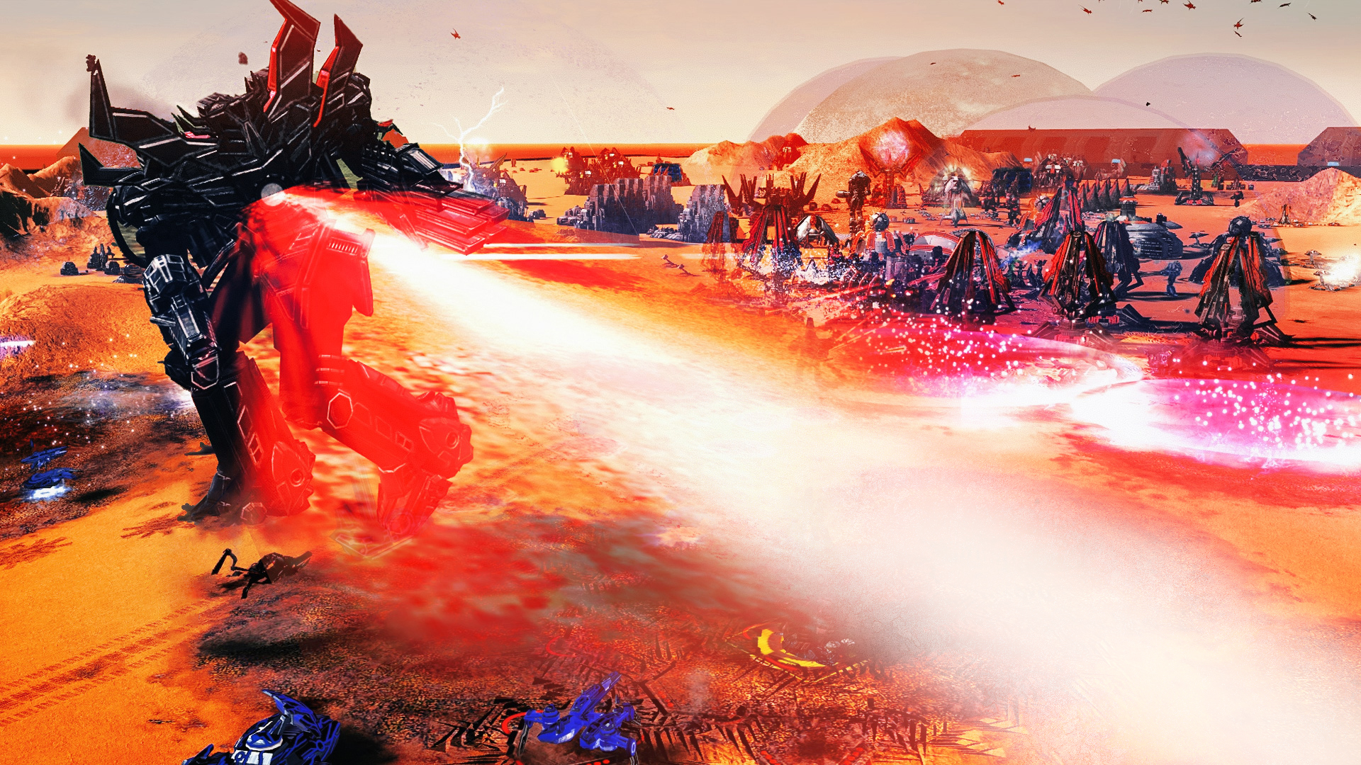
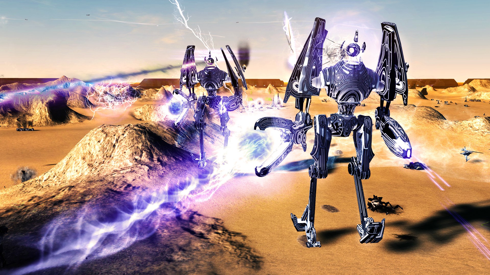
And I'm pretty sure we can argue which ingame picture looks the best. But I still believe the ones from Lidlsid look better.
These are the ones I'm using for the login (all unoptimized yet and hosted on content.faforever.com now):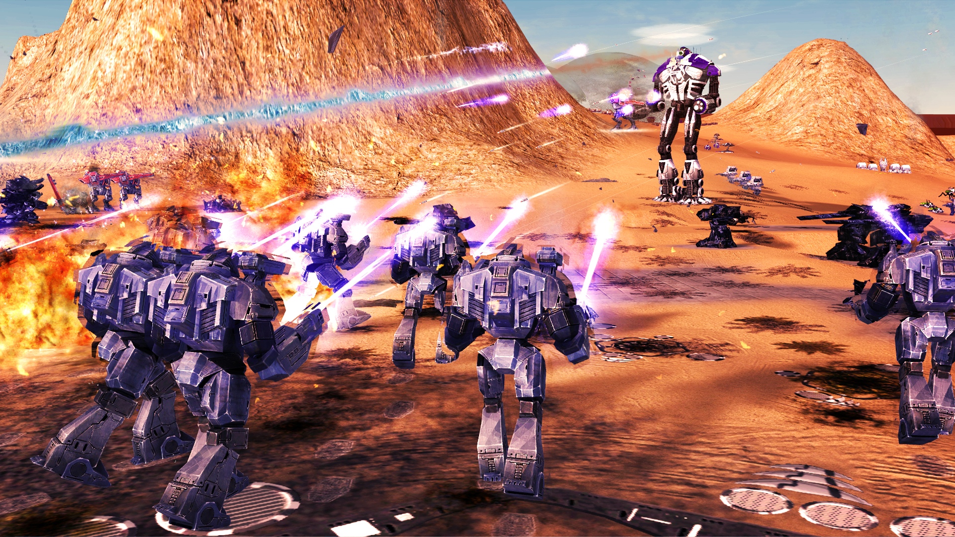
-
Ideas:
1
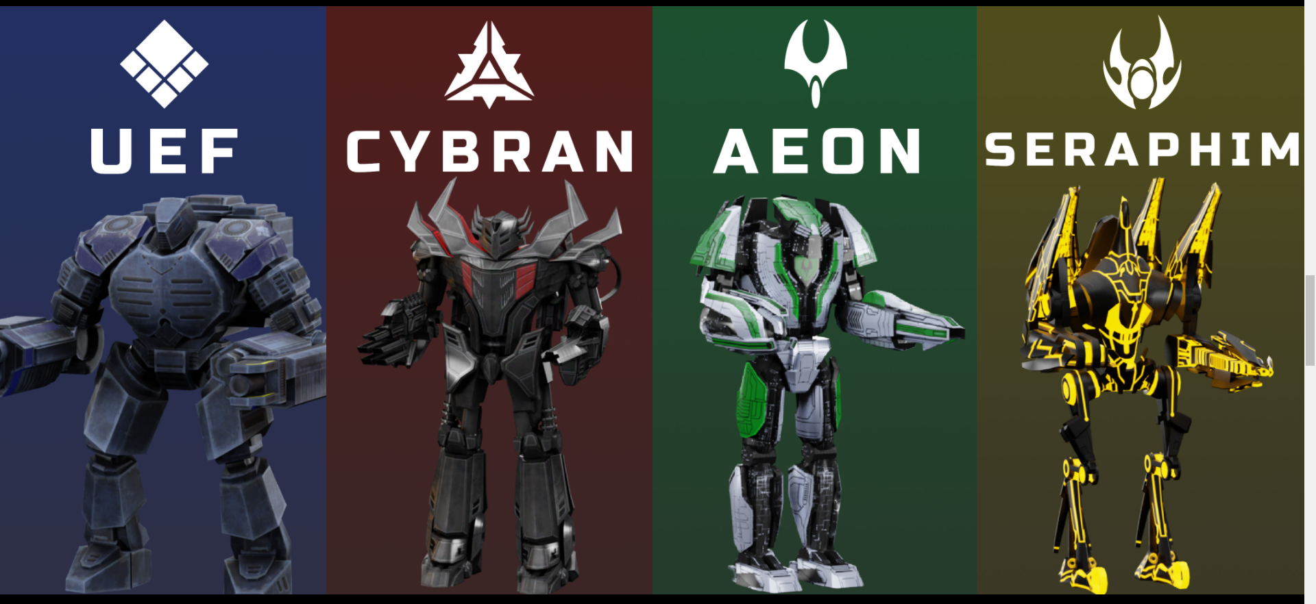
remake them as and can be added some gif previews on hover that will show the whole factions in seconds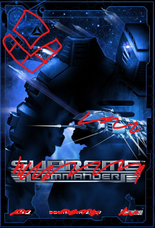
2
Rebuild this section with animated gif on scroll. That will show the affect of camera and rendering of icons and etc
3
Same for this, static image cant say anything interesting,
4
Lack of examples of "TOTAL CONTROL
SUPREME COMMANDING"
5
AND WHERE IS NOMADS man
6
Strokes, they are everywhere


-
@eternal said in FAF Website 4.0 on the way!:
Ideas:
1
remake them as and can be added some gif previews on hover that will show the whole factions in secondsSure this may not be intuitive right now you can click on them and they display an image that would be better with a hover possibly.
@eternal said in FAF Website 4.0 on the way!:
2
Rebuild this section with animated gif on scroll. That will show the affect of camera and rendering of icons and etc
3
Same for this, static image cant say anything interesting,
Multiple GIFs on the same page can increase the load on the website as well as for people trying to load the page itself it they are on a metered connection.
@eternal said in FAF Website 4.0 on the way!:
5
AND WHERE IS NOMADS man
6
Strokes, they are everywhere
Nomads will not be added as a standalone faction on the website as it is not an OFFICIAL Faction that is in the base game of faf it is a MOD.
I've recently spoken with javi and the final version on the main website will be using the latest version of Bootstrap 5 and buttons will be using the base class from that with a few minor tweaks here and there
-
@rowey said in FAF Website 4.0 on the way!:
Multiple GIFs on the same page can increase the load on the website as well as for people trying to load the page itself it they are on a metered connection.
Well-optimized gifs (at the cost of the number of colors) can be quite low in size, especially when they are only a few seconds. It is worth experimenting with, maybe someone else has experience in this matter to help us out.
-
This post is deleted!