FAForever Forums
    • Categories
    • Recent
    • Tags
    • Popular
    • Users
    • Groups
    • Login
    1. Home
    2. macdeffy
    M
    Offline
    • Profile
    • Following 0
    • Followers 0
    • Topics 2
    • Posts 97
    • Groups 0

    macdeffy

    @macdeffy

    47
    Reputation
    39
    Profile views
    97
    Posts
    0
    Followers
    0
    Following
    Joined
    Last Online

    macdeffy Unfollow Follow

    Best posts made by macdeffy

    • Redux Strategic Icons

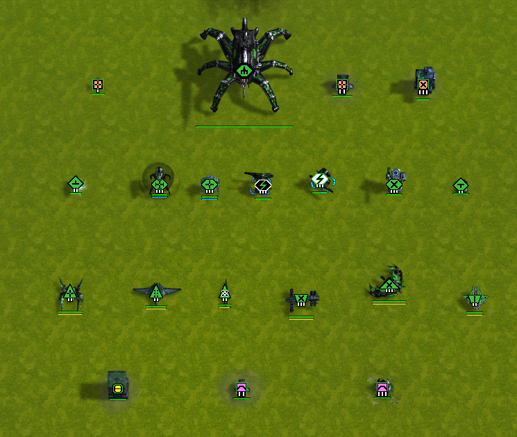
      Slight changes with a few more unique icons added. Default FAF, and larger sizes.

      Unfortunately the larger unscouted icon sizes via Advanced Strategic icons.nxt is longer allowed, but you can still use it in offline mode, just not on the FAF client. So I've left those in the zip files.

      ACUS.png

      misc.png

      mexes.png

      Readme instructions are in the download.

      Default Size

      1200 Size

      2K Size

      The Following includes versions with black and white selection icons, if you want to distinguish unit selections even more. There are two variants each for Default and 2k sizes.
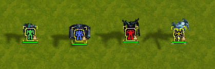
      Black and White Edition

      Easy enough to experiment with different combinations by moving versions around.

      Icon mods don't always seem to load the first time you select them. Usually closing and reopening does the trick. I have seen where selecting the icons in offline mode works, and then you have to repeat the procedure in FAF client before they start loading there.

      I've been asked by a couple of people if they can use my icons. I have a feeling most are only interested in the ACU icons. Consider this a blanket authorization to whoever wants to use them.

      posted in Contribution
      M
      macdeffy
    • Kyro's lobby - updated

      Updated this so it would work with any UI scaling, with other misc changes.

      Also added additional buttons to change Share Mode and Balance without going into options menu.

      For those who've never used it, it's simply shows the Teams separated into two columns with each team rating and game count to more easily see the balancing.

      there is a drop drop down menu with different sort options so the proper opposing slots are matched up. This unfortunately will not line up slots perfectly in all maps, but it still makes it easier to balance the teams if not the slots.

      It reverts to default single column for non team games, or if you disable it from Team Sorting Menu. It will also do so for Survival Games.

      Readme.txt has more details on install, and other changes. Click the the download button in upper right to download the zip file.

      Nov 27th - added quick swap from current patch and other misc changes

      Dec 22th - renamed file to kyros.nxt to work with new patch

      May 8th - 2022 - currently works. added in what I could from current lobby.

      Sep 9th - 2022 - Survival Maps with unusual Team placement would fail to load. Disables for any survival maps. Now also saves Map AutoTeams setting.

      Septh 11th - 2022 - Moved Magnify Down so it doesn't block corner slot. Added Different Languages where able.

      https://drive.google.com/file/d/1iLzboy6N6AHiSoTA-EEHi2ZWosSu2OsF/view?usp=sharing

      posted in Modding & Tools
      M
      macdeffy
    • RE: Downsides of the Advanced Strategic Icons mod

      It would be nice to have control over which icons would take precedence in foreground focus. i noticed when modifying files, that sometimes the wrong thing would overlap, e.g. the mass storage would block out the mex, but i'm not sure what caused it.

      posted in General Discussion
      M
      macdeffy
    • RE: Small suggestions topic

      Or at least a notification that the units went to you, sometimes you are deep in battle and not paying attention.

      Or a lobby option that splits units equally so as to not give one person crazy eco, but maybe that is too much to implement since this is meant to be small suggestion.

      posted in Suggestions
      M
      macdeffy
    • RE: Downsides of the Advanced Strategic Icons mod

      while i use the advanced strategic icons mods, with the medium icons and in higher resolution, the overlap can be an issue in certain situations. A big thing I didn't like with them was that the white border could be obnoxious with a lot of units, and other items such as storage around mexes was less discernible when zoomed out.

      which is why i modified the icons to make them a little less garish. Where possible, I adjusted some icons to be slightly different size to differentiate tech levels, etc. other icons such as t3 gunship and t3 bomber, i changed the tactical icon because i couldn't tell them apart when zoomed out.

      here is my take for anyone that wants to give it a try, just backup your original file in case you don't like. all based on medium set, since i run a higher resolution.

      https://drive.google.com/file/d/1BztpHQoY-zDCZccRLE_zJ370G9kwl-fX/view?usp=sharing

      posted in General Discussion
      M
      macdeffy
    • RE: Small suggestions topic

      As much as I like the draggable queue (and i understand it has bugs) sometimes i really just want a build this unit right now, and then go back to the previous queue, without fiddling with it. Yes i know you can stop all but one current unit and then add unit, but then there goes my queue. Would be nice to have a hot key (alt maybe?)- click unit, and then back to more important things.

      posted in Suggestions
      M
      macdeffy
    • RE: Downsides of the Advanced Strategic Icons mod

      While the borders are probably intended to help differentiate it at a glance, I agree that these borders aren't really necessary, or there is simply a better way to go about it. Maybe I'll try and modify the default icon set to bridge the gap between the two to find a happy medium. I wish the icons were vector based.

      posted in General Discussion
      M
      macdeffy
    • RE: UI scaling for ultrawide monitors?

      You can do what I do, which is modify the Scaled Resource Panel so that it is in the middle of your screen, along with the other multifunction panel.

      https://drive.google.com/file/d/15Q2aN-L8VXiPax4H1iDeI5FGWYEg_EYJ/view?usp=sharing

      in hook\ui\game\layouts there is economy_mini and multifunction_mini. Search for --LayoutHelpers (there are several different ones that need updating), which are the orig values, and below you will see the updated values. You will see the larger value is the updated value to bring it closer to center.

      Use UI-party to move the main menu to the right so it doesn't interfere. You can also modify it to be less further right if needed.
      You can do the same with SupremeScoreBoard if you want to find and tinker with the values. It has its own copy of these it uses as well, if you prefer a smaller economy panel, but I delete that file in SSB so it doesn't interfere.

      The engineer panel on the right, i'm not sure about. Good luck.

      posted in I need help
      M
      macdeffy
    • RE: Downsides of the Advanced Strategic Icons mod

      I don't mind taking a crack at putting together a different set of icons, though it would take time, i've already done it for my own amusement on the medium set of ASI but like others have said, the visibility of units is still quite a bit hit or miss.

      It seems that many players are fine with how the general units/tanks/arty and such appear, and many of the complaints stem from the other icons just being "TOO MUCH" visually, which is a fair complaint. I felt the same way when I first used them and while I did get used to them, many times its just a wash of icons.

      So I think perhaps just starting out with like others have said with TML, nuke, acu vs sacu ( which i already did for myself) but also perhaps the TML, radar, are still not subtle enough.

      what are thoughts on what a good compromise should be? I personally like having the mexes a little more distinguishable, but maybe ASI design just isn't it. I changed my Engies to have 1, 2, and 3 visible because I can't see the little tech lines zoomed out, but maybe that is also too much. I linked that above.

      Perhaps people can provide their own versions to find something that could become a new default if it's popular enough. No reason we can't crowdsource this.

      posted in General Discussion
      M
      macdeffy
    • RE: How should UI mod(s) change in-game icons?

      We discussed this a bit one the other thread. TML, sacu and nukes are obvious choices.

      I changed both the t3 gunship and t3 bomber to use the armored t3 bot x emblem instead of the + because it was easier to see at a glance. The T2 and t3 gunships are especially hard for me to distinguish zoomed out but this small change helps.

      Making some icons, a pixel wider, while subtle helps to differentiate tech level.

      I would personally like to have kennel drone engies be able to have different icon from default engineers.

      I plan to test the default icon set to see what pixel size starts to cause overlap issues, and to test different sizes to increase visibility without adding clutter.

      I would also like to point out that some of ASI issues is that the white borders are just too pronounced in some cases and making them thinner worked for me.

      Cptant. I put a sash over sacu. Simple but easy to spot.

      posted in General Discussion
      M
      macdeffy

    Latest posts made by macdeffy

    • RE: UI scaled too far

      you can add the line to game.prefs, but the in-game option, is options -> interface -> third line down

      posted in General Discussion
      M
      macdeffy
    • RE: Client UI freezing

      right click Shortcut, Properties -> Compatibility -> Change high DPI settings -> High DPI scaling override -> Override high DPI scaling behavior.

      posted in I need help
      M
      macdeffy
    • RE: Game UI is not right

      The actions panel is usually to the left of the build queue on FAF. Perhaps you have something (mod) enabled that is putting it to the right. I couldn't find a built-in setting for this that i can recall, though there are ways to move these items around by modifying existing mods.

      At any rate FAF at default settings put's that to the left of the build queue, so you may want to start there.

      posted in Game Issues and Gameplay questions
      M
      macdeffy
    • RE: 2D Sound

      I've posted this previously on another post, but for me I have to install Equalizer APO. ( the other post specified my specific configuration, it takes a bit more than simply installing it to ensure it is working ) some trial and error might be required.
      you can use the configuration editor to add a preamp to ensure it's working.
      For the arctis 7 usb headset ( amongst others) that have their own quasi surround sound, this is the only method to fix this for me.
      Even for this particular headset, disabling the 7.1 surround option, and setting it to 2.1 in windows has no effect.
      A past version of their steel series software did not have this issue. I could set a profile to disable their surround setting for specific exe, but past a certain update, it stopped working, and uninstalling their software all together had no effect ( i suppose maybe it did something firmware wise on the headset, but who knows )
      At any rate, there are some pretty nice addons for this software, PEACE GUI. there is also a 7.1 surround add-on called Hesuvi and with some tinkering you can switch back and forth from 2.1 to 7.1 profiles, but that is a lot more advanced and has it's own issues.

      hopefully this helps.

      posted in I need help
      M
      macdeffy
    • RE: Redux Strategic Icons

      You will have to use ui_strategicscalesize command. Can no longer use nxt files.

      I'm not sure if this affects un scouted icons though.

      posted in Contribution
      M
      macdeffy
    • RE: Kyro's lobby - updated

      oh yeah. i was messing about with the LOC values because originally there were none used by the column labels, but it didn't work for the chinese characters. it was mostly me just seeing if it worked. i had forgotten completely about it and am not even sure the translation is correct.

      otherwise thanks for putting up the github. i wasn't really sure how to go about it, or even make use of it, but hopefully this gives others an avenue for fixing it properly.

      posted in Modding & Tools
      M
      macdeffy
    • RE: WD #3 - Ridiculous Balance Ideas

      Temporary gifting of units that return back after a set period of time.

      posted in Weekly Discussions
      M
      macdeffy
    • RE: EcoManager still broken? (can't turn off throttling)

      you may want to try eco ui tools instead, you'll have to set it up in the ui mods tools options for it to work, but it's pretty close , with exception of no single click to upgrade, but assisting with engies will work same way, and you can just click unpause button to start the upgrade after selecting it if not doing it via engie.

      or you can try this version with the ECO throttling and nuke overlays stripped out. it only does mex upgrades.

      https://drive.google.com/file/d/1JJUNAbRUvRKI2KkmeVbtqD2OLfU9pXT9/view?usp=share_link

      actually this one has EM with everything but the throttling is disabled

      https://drive.google.com/file/d/1kwiu0xYTecEVPdge4nLHkw5XhqDF93Pl/view?usp=share_link

      posted in Game Issues and Gameplay questions
      M
      macdeffy
    • RE: Redux Strategic Icons

      I'll have to take a look as I'm not sure what you mean. I didn't notice anything myself. I wasn't even aware anything changed on the mini map.

      If it is a size issue then using the new link above rather than vault uses default size as opposed to what is in vault.

      If you mean something else i need to know what that is.

      posted in Contribution
      M
      macdeffy
    • RE: Redux Strategic Icons

      which size were you using? i thought i had made them all gold for non selected, and white for selected, but perhaps i only did that on the 1440 size. But let me know which size regular, 1080, or 1440 and clarify if you wanted the selected to be red, or the non selected icon to show red, or both. Can't swear i'll get it to it immediately, but i'll throw up a link when i do.

      posted in Contribution
      M
      macdeffy