FAForever Forums
    • Categories
    • Recent
    • Tags
    • Popular
    • Users
    • Groups
    • Login

    Graphic Artist Wanted

    Scheduled Pinned Locked Moved General Discussion
    96 Posts 25 Posters 6.6k Views 4 Watching
    Loading More Posts
    • Oldest to Newest
    • Newest to Oldest
    • Most Votes
    Reply
    • Reply as topic
    Log in to reply
    This topic has been deleted. Only users with topic management privileges can see it.
    • tatsuT Offline
      tatsu
      last edited by tatsu

      I prefer petric's design to my own. I'm a real sucker for the color blue plus his design really exploits the new 80x40 form factor much better (If I were to make icons for that 80x40 form factor I'd start from scratch I'd use neither of the two ideas I posted above)

      @Fremy_Speeddraw
      Anyways final thoughts :

      the ribon tiers are a bit funky, for example, silver tier makes alot of sense to me: c69943a4-229a-4c91-87cc-deadc758bd6c-image.png
      kinda pyramid-looking, you know, whatever, it's dynamic.

      Bronze (I think it should be called copper)
      has a lot more contrast going because of the gap between the pentagon tier holder and the ribbon. it's utter genius.
      f179f8fc-3a44-4cc6-bf14-6c05cc13decd-image.png

      I get what was being going for with the other upgrades I guess Diamond is the one that's most visually pleasing after those two
      38e82a90-b7c0-4a4c-b5a9-8e7daa6254ae-image.png

      gold is not one people will be looking forward to in it's present state (all this is still only about the ribbons) :
      08fd6ac1-b689-4fee-8e9b-d30670add093-image.png

      granted the upper one is slightly wider but basically the eye auto-corrects it to the same width.

      (you could for example exaggerate this a bit)
      image.png

      I think it plays off better. maybe that's silly of me.

      master's reeeeally funky:
      92e4ddc9-571f-4617-b6c6-e449dd7fd711-image.png

      funky can be nice in certain contexts, I dunno.

      It just has way too much tikki mask vibe to me.

      I realize this is a bit more bland but what do you think of this (sorry for the low effort msPaint edit) :
      image(1).png

      also I get the red and yellow tier marker thing, it's contrast. it makes the icon as a whole pop.
      so that should probably stay but maybe be reworked.
      maybe placed instead of those little wings in the same spot :
      90c12c00-4efa-4e8b-af84-c267ce7ac2fd-image.png
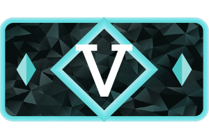
      which for 90% of the tiers and subtiers are utterly invisible.

      Also a big plus one to @Askaholic 's idea of stars or other makers instead of the roman numeral.

      How to setup FAF on linux

      1 Reply Last reply Reply Quote 0
      • Mvk_-M Offline
        Mvk_- Banned
        last edited by Mvk_-

        They are all nice and of great works, was hoping something outside the norm, there was some ideas of interest that seemed to be what to find, but think have gotten lost since.

        Id rather say these icons if there was ever a group creation update to some point.

        1 Reply Last reply Reply Quote 0
        • WasserMelonW Offline
          WasserMelon
          last edited by WasserMelon

          I also made a concept of some icons altho lacking in detail. I went for a simple look.
          Bronze:
          ico-rank-faf-g-dev-b1-v2.png

          ico-rank-faf-g-dev-b2-v2.png

          ico-rank-faf-g-dev-b3-v2.png

          ico-rank-faf-g-dev-b4-v2.png

          ico-rank-faf-g-dev-b5-v2.png

          Silver:
          ico-rank-faf-silver-s1.png

          ico-rank-faf-silver-s2.png

          ico-rank-faf-silver-s3.png

          ico-rank-faf-silver-s4.png

          ico-rank-faf-silver-s5.png

          Gold:

          ico-rank-faf-gold-g1.png

          ico-rank-faf-gold-g2.png

          ico-rank-faf-gold-g3.png

          ico-rank-faf-gold-master.png

          ico-rank-faf-gold-g5-v12-2.png

          1 Reply Last reply Reply Quote 3
          • tatsuT Offline
            tatsu
            last edited by

            simple and efficient. what would the two next tiers and the final tier look like?

            How to setup FAF on linux

            WasserMelonW 1 Reply Last reply Reply Quote 0
            • RoweyR Offline
              Rowey
              last edited by

              I do like Petrics Desgin but for me the Gold and Broze look a bit too simular from a quick glanse

              "The needs of the many outweigh the needs of the few" - Spock

              1 Reply Last reply Reply Quote 0
              • MadMaxM Offline
                MadMax
                last edited by MadMax

                i much prefer wassermelon kiss (keep it simple stupid) approach the other designs look to busy apart from askaholic's early draft

                Vault Admin / Creative Team / Map Guru

                1 Reply Last reply Reply Quote 0
                • WasserMelonW Offline
                  WasserMelon @tatsu
                  last edited by WasserMelon

                  @tatsu I was thinking of replacing Diamond with Crystal just for fun :D. I have a few drafts for the two higher tiers but the final tier is still in the idea phase.

                  Crystal/Diamond:
                  ico-rank-faf-crystal-dev-v3.png

                  Master/Maybe some other gemstone:
                  ico-rank-faf-master-master.png

                  Coloring not final

                  1 Reply Last reply Reply Quote 1
                  • tatsuT Offline
                    tatsu
                    last edited by tatsu

                    I can dig that.

                    what about grand-master?

                    don't you think they'd look much better if they weren't a single stone slab/ thinner?
                    image(2).png

                    and then you would have two axi of progression : color and thickness, grandmaster being the full block.

                    @IDontKnow said in Graphic Artist Wanted:

                    I do like Petrics Desgin but for me the Gold and Broze look a bit too simular from a quick glanse

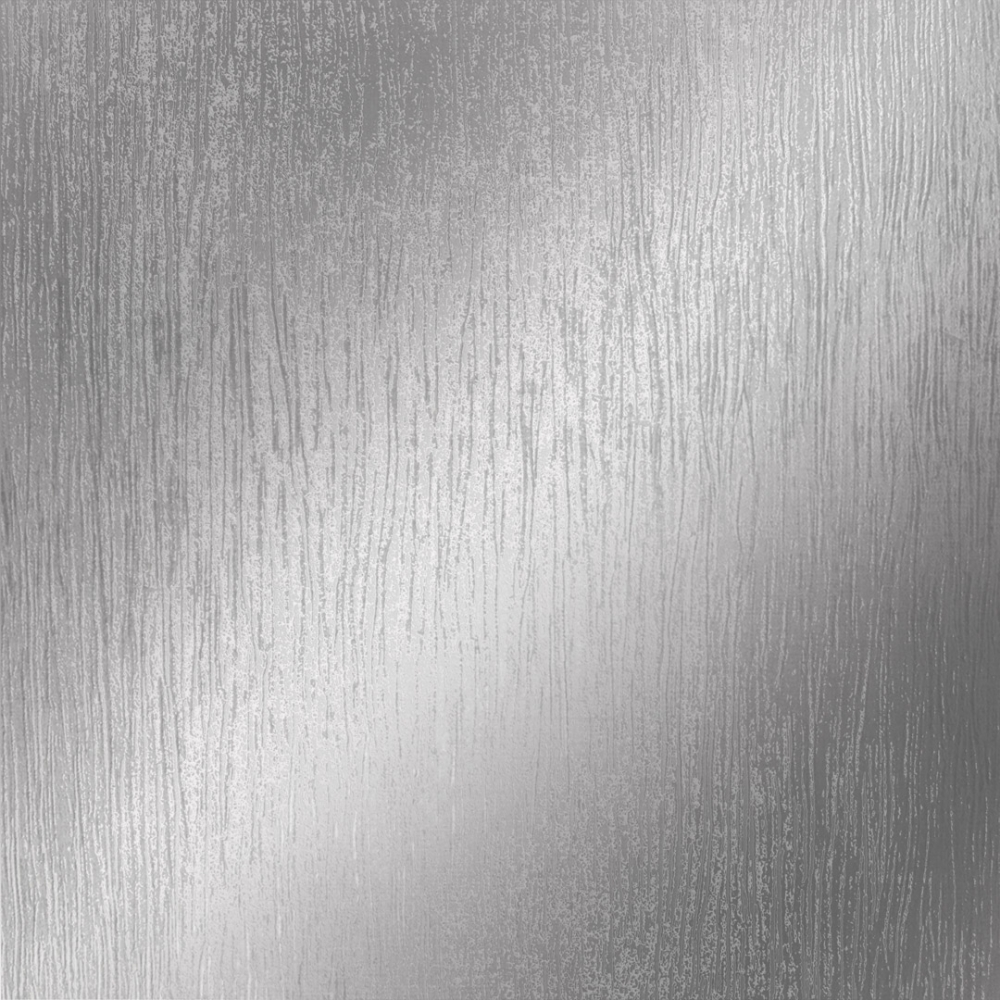
                    I don't get that feeling at all. bronze (or rather copper) clearly looks like copper and gold clearly looks like gold, look:

                    4cecb1c9-93df-423a-893a-5e26294c7494-image.png 73af9653-da9e-428d-bdc9-6dc26fbc033f-image.png

                    maybe gold could be a brighter hue, a bit more reflective? copper looks fine to me though.

                    How to setup FAF on linux

                    1 Reply Last reply Reply Quote 0
                    • BlackYpsB Offline
                      BlackYps
                      last edited by

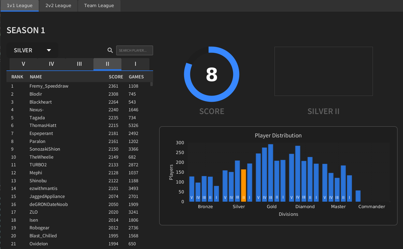
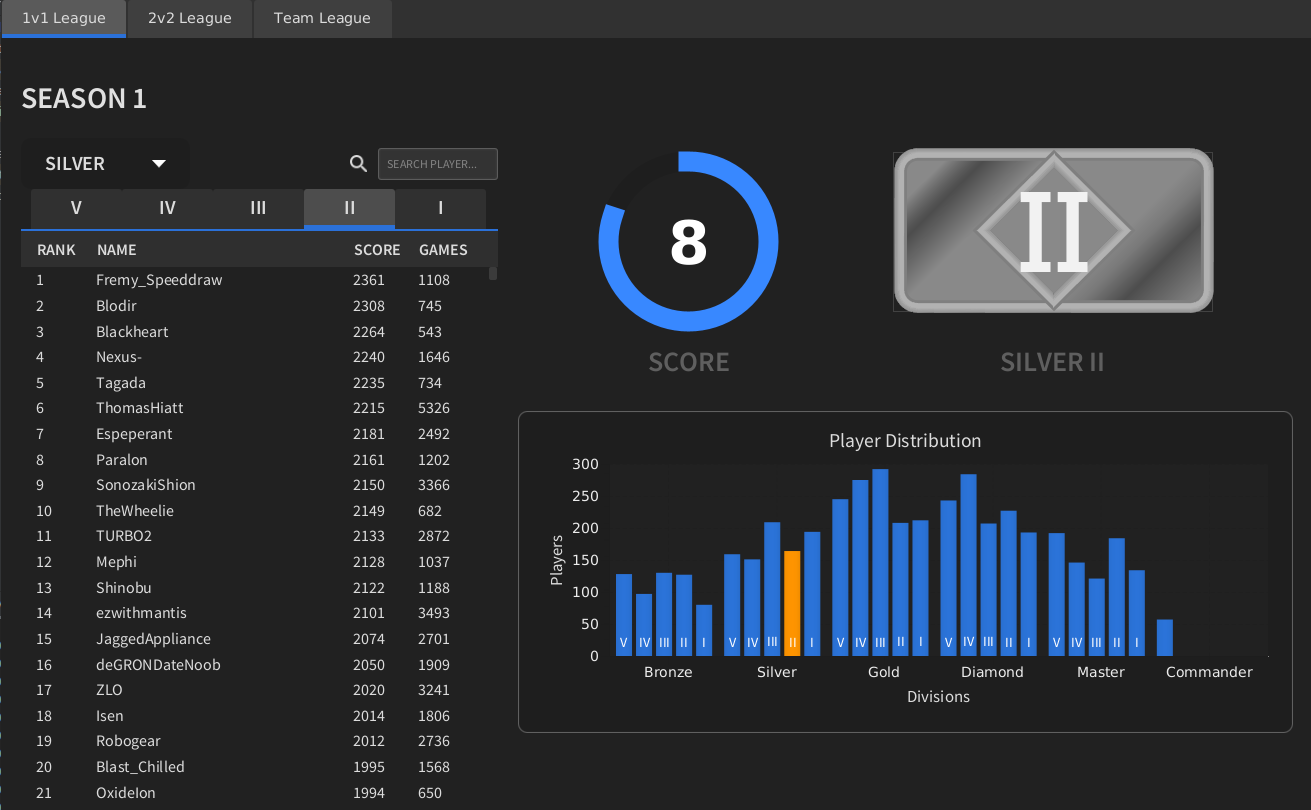
                      Please keep in mind that we also need a big version. I don't think that a quite simple icon would look that good when it is ten times the size.

                      WasserMelonW 1 Reply Last reply Reply Quote 0
                      • WasserMelonW Offline
                        WasserMelon @BlackYps
                        last edited by

                        @BlackYps I have done a color remaster of the icons for the large verison. I am tinkering with adding some more detail for the larger version.
                        mockup-s2-dev2.png

                        1 Reply Last reply Reply Quote 1
                        • K Offline
                          keyser
                          last edited by

                          Issue i've with petric ones, is that it looks shitty for avatars

                          tatsuT 1 Reply Last reply Reply Quote 1
                          • tatsuT Offline
                            tatsu
                            last edited by tatsu

                            @WasserMelon progress but doesn't look good enough, I think you'll have to push this waaaaaaaaay way further.

                            try photorealistic silver and gold ect :
                            2141717c-63d5-4a72-91cf-e050b3654be5-image.png
                            you need to occupy the pixels otherwise it'll look way too bland.

                            How to setup FAF on linux

                            1 Reply Last reply Reply Quote 0
                            • tatsuT Offline
                              tatsu @keyser
                              last edited by tatsu

                              @keyser said in Graphic Artist Wanted:

                              Issue i've with petric ones, is that it looks shitty for avatars

                              the 20x40 size, you mean?

                              yeah I agree, but wasn't the implication that Aeolus avator base size would be increased or did I missunderstand?

                              How to setup FAF on linux

                              biassB 1 Reply Last reply Reply Quote 0
                              • biassB Offline
                                biass @tatsu
                                last edited by

                                @tatsu said in Graphic Artist Wanted:

                                @keyser said in Graphic Artist Wanted:

                                Issue i've with petric ones, is that it looks shitty for avatars

                                the 20x40 size, you mean?

                                yeah I agree, but wasn't the implication that Aeolus avator base size would be increased or did I missunderstand?

                                I'm uncertain if the avatar size in aeolus can be increased, and to be honest, it's probably not a good idea.

                                Icons in the actual TMM party tabs as shown in screenshots around here is fair game.

                                1 Reply Last reply Reply Quote 0
                                • WasserMelonW Offline
                                  WasserMelon
                                  last edited by

                                  @tatsu I've made some progress with photorealistic textures as you sugested, I enjoy the outcome but would be great if the change is begin made from 40x20 to 80x40. And perhaps do you know when the deadline is?

                                  I have to correct some stuff to make the ranking a bit more clear. Here is how they would look.

                                  40x20
                                  ico-rank-faf-crystal-master.--asasas.png

                                  300x200
                                  crystal.png

                                  1 Reply Last reply Reply Quote 3
                                  • tatsuT Offline
                                    tatsu
                                    last edited by

                                    I still think these lack in shape.

                                    it's a bit of a shame to use 100% of the allotted space save for rounded borders instead of playing a bit more with empty space as the above examples have done.

                                    How to setup FAF on linux

                                    1 Reply Last reply Reply Quote 0
                                    • archsimkatA Offline
                                      archsimkat
                                      last edited by

                                      Why is there still discussion about existing proposals that aren't Petric's?

                                      BigMamaMurderB 1 Reply Last reply Reply Quote 0
                                      • BigMamaMurderB Offline
                                        BigMamaMurder Banned @archsimkat
                                        last edited by

                                        @archsimkat said in Graphic Artist Wanted:

                                        Why is there still discussion about existing proposals that aren't Petric's?

                                        I don't have a dog in this fight (although I should tbh) - I think Petric's designs are nice, but are too busy. They force the eye to make sense of them, and that's less optimal.

                                        .
                                        .
                                        .
                                        .
                                        .
                                        .
                                        .
                                        .
                                        .

                                        PS. Did anybody ever play the arcade game Rygar? Hint hint...

                                        1 Reply Last reply Reply Quote 1
                                        • AzraaaA Offline
                                          Azraaa
                                          last edited by

                                          Isnt busy the entire point of the damn Icons

                                          Developer for LOUD Project | https://discord.gg/DfWXMg9
                                          AI Development FAF Discord | https://discord.gg/ChRfhB3
                                          AI Developer for FAF

                                          Community Manager for FAF
                                          Member of the FAF Association
                                          FAF Developer

                                          1 Reply Last reply Reply Quote 0
                                          • BigMamaMurderB Offline
                                            BigMamaMurder Banned
                                            last edited by

                                            Surely not?

                                            AzraaaA 1 Reply Last reply Reply Quote 1
                                            • First post
                                              Last post